Design comparison
Community feedback
- @khaduj03Posted 7 days ago
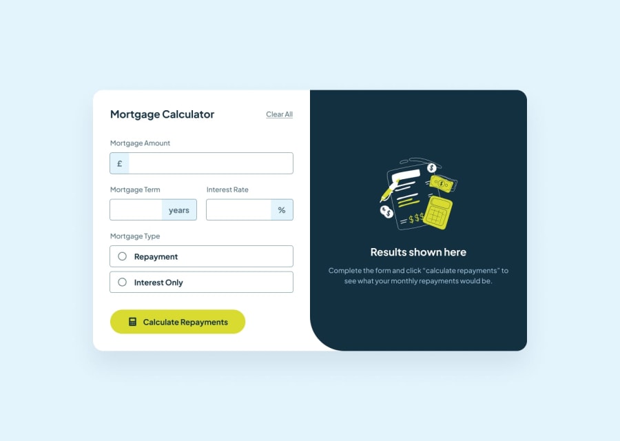
Great effort on your project! 🌟 I have a suggestion to make your project more interactive and user-friendly. You can use a form with inputs and radio buttons to let users provide details for the mortgage calculator. For example, you can include fields like:
<form>
  <label for="term">Mortgage Term (in years):</label>
  <input type="number" id="term" name="term" placeholder="Enter term in years" />

  <label for="interest">Interest Rate (%):</label>
  <input type="number" id="interest" name="interest" placeholder="Enter interest rate" step="0.01" />

  <p>Mortgage Type:</p>
  <label>
    <input type="radio" name="mortgageType" value="repayment" /> Repayment
  </label>
  <label>
    <input type="radio" name="mortgageType" value="interestOnly" /> Interest-Only
  </label>

  <button type="submit">Calculate</button>
</form>
This approach adds flexibility for users to enter their data and select options, making the calculator more dynamic.
Also, since it seems you’re at the beginning of your learning journey, I’d recommend starting with smaller HTML and CSS-only projects to build confidence and maintain motivation. Your effort so far is commendable—keep practicing, and you'll improve quickly! 🚀👏
0
Please log in to post a comment
Log in with GitHubJoin our Discord community
Join thousands of Frontend Mentor community members taking the challenges, sharing resources, helping each other, and chatting about all things front-end!
Join our Discord
