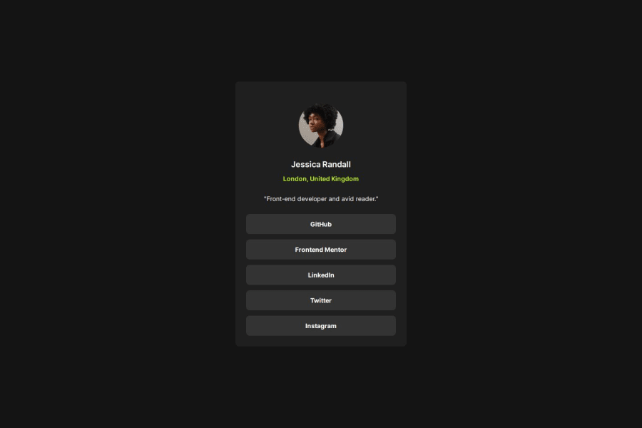
Design comparison
SolutionDesign
Solution retrospective
What are you most proud of, and what would you do differently next time?
It's getting easier the more I do :)
One issue is accessibility. I tried adding 'a' but it doesn't seem tab navigatable. I will read into tab index and aria more.
What challenges did you encounter, and how did you overcome them?Did this without the Figma, so it won't be pixel perfect.
What specific areas of your project would you like help with?I need to read into tab index and aria more. Any advice on helping make it more keyboard accessible appreciated :)
Please log in to post a comment
Log in with GitHubCommunity feedback
No feedback yet. Be the first to give feedback on innitman's solution.
Join our Discord community
Join thousands of Frontend Mentor community members taking the challenges, sharing resources, helping each other, and chatting about all things front-end!
Join our Discord
