Submitted over 1 year ago
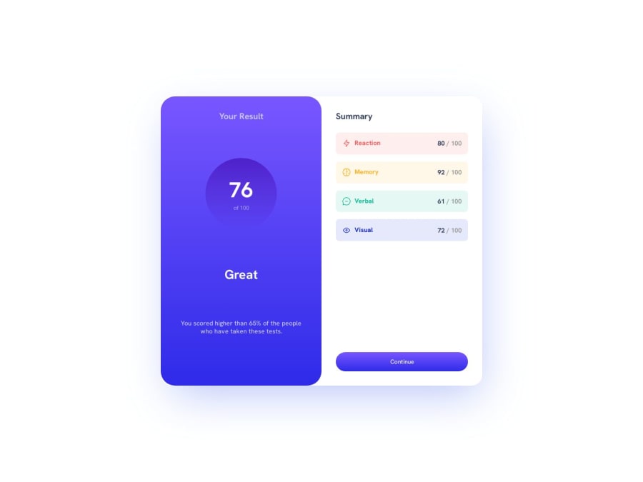
Diving back into CSS with a results summary component
@lalvarezz
Design comparison
SolutionDesign
Community feedback
- @jGsouzaJrPosted over 1 year ago
Your work is very good, but you still need to have a notion of alignment!
You can imagine a line under the word Great crossing over to the other horizontally and having to put the element in the same alignment!
I don't know what your browser is but if it's Chrome use the VisBug extension
Hope this helps!
0
Please log in to post a comment
Log in with GitHubJoin our Discord community
Join thousands of Frontend Mentor community members taking the challenges, sharing resources, helping each other, and chatting about all things front-end!
Join our Discord
