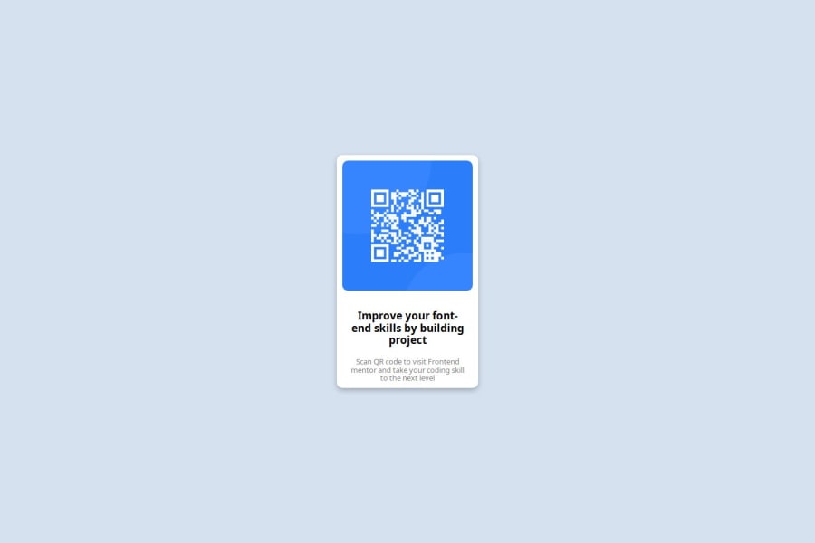
Design comparison
SolutionDesign
Community feedback
- @Jun41dUPosted 3 months ago
Looking great for the first project. I like the semantic HTML using headers correctly. Only discernible difference to the design is the choice of font and small differences in margin size. Use
<link href="https://fonts.googleapis.com/css2?family=Outfit:[email protected]&display=swap" rel="stylesheet"> for the correct font0 - @Wasu44Posted 3 months ago
Hello You did very good job with your project but I can see a few issues.
- You are using px units instead of rem because rem units are resposive and here is video explaining how it works link
- You could be a bit more patient, as your solution isn't exactly similar to the design
- I hope You find it helpful
0
Please log in to post a comment
Log in with GitHubJoin our Discord community
Join thousands of Frontend Mentor community members taking the challenges, sharing resources, helping each other, and chatting about all things front-end!
Join our Discord
