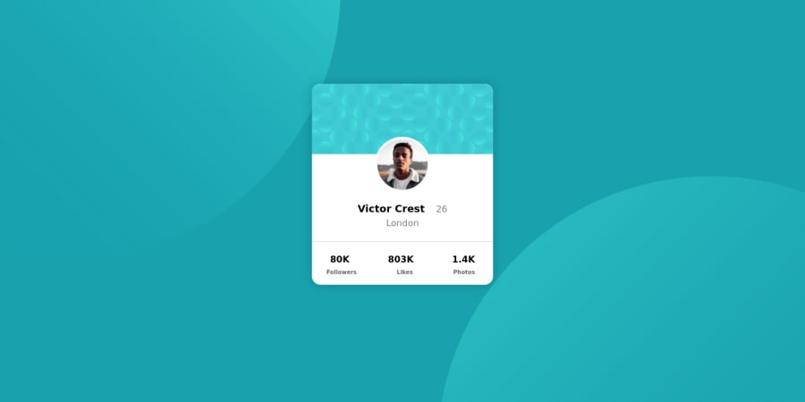
Design comparison
SolutionDesign
Community feedback
- @correlucasPosted over 2 years ago
👾Hello Mohit, congratulations for your new solution!
Your solution is just great, I can see that you;ve done a good work here. The hardest part you did that was the background circles. I've only one tip for you:
Your image profile is not aligned a better way to align it to the card center is using flexbox in this class
profileimgand remove the margins from the img selector, see the code fixes below:.profileimg { margin: auto; display: flex; align-items: center; justify-content: center; }👋 I hope this helps you and happy coding!
Marked as helpful0@MOHITBILALAPosted over 2 years ago@correlucas Thanks sir, I'll add this to my image section. Thank you for your help.
0
Please log in to post a comment
Log in with GitHubJoin our Discord community
Join thousands of Frontend Mentor community members taking the challenges, sharing resources, helping each other, and chatting about all things front-end!
Join our Discord
