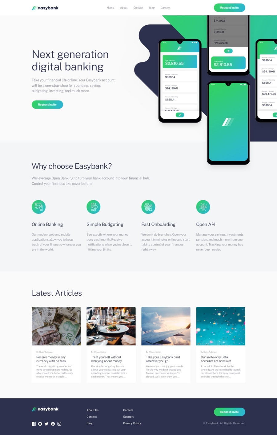
Design comparison
Solution retrospective
am not sure of the mobile view pertaining to the container also i didn't do the navbar for the mobile using Js i haven't start Js
Community feedback
- @VictorBrito13Posted over 1 year ago
Hey I saw your site and it is ok but I recommend you to remove the margin to the div with classes: 'all' and 'in-all' and use padding instead, this gonna make that the elements add a "intern margin" instead outside and this wont break your layout, also you can check this link: https://developer.mozilla.org/en-US/docs/Web/CSS/padding. And also you can use the "background-image"(https://developer.mozilla.org/en-US/docs/Web/CSS/background-image) property to set a image as background instead create 2 "img" tags.
0
Please log in to post a comment
Log in with GitHubJoin our Discord community
Join thousands of Frontend Mentor community members taking the challenges, sharing resources, helping each other, and chatting about all things front-end!
Join our Discord
