Design comparison
SolutionDesign
Community feedback
- @Kamasah-DicksonPosted over 2 years ago
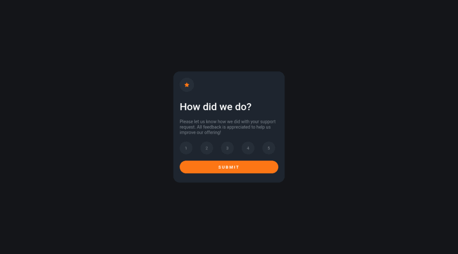
I like how the selection works on the numbers. Also you forgot to add margin left and right on the card so on smaller devices it spans horizontally. Besides Good job there👍 Happy coding👍
Marked as helpful0
Please log in to post a comment
Log in with GitHubJoin our Discord community
Join thousands of Frontend Mentor community members taking the challenges, sharing resources, helping each other, and chatting about all things front-end!
Join our Discord
