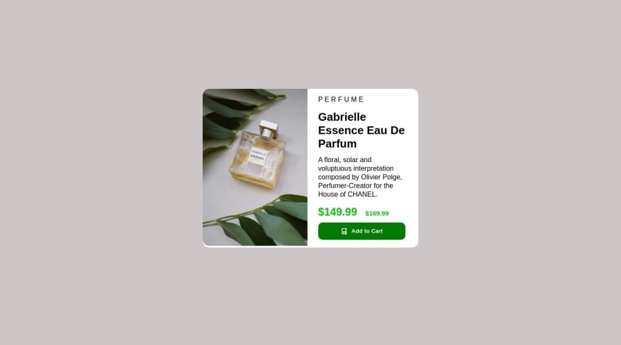
Design comparison
SolutionDesign
Solution retrospective
If anyone has tips on how to improve, I'll take it. :)
Community feedback
- @pRicard0Posted over 1 year ago
Some CSS tips.
- I think you can change the color of the button when the mouse is over the button. You can add a transition for a smoother color change.
- You need to use the fonts
- You should try to make your solution more like the original design.
Some HTML tips.
- I think you need to improve the class names. Instead of using section with the class left or right you can use "image" and "text" for example
0
Please log in to post a comment
Log in with GitHubJoin our Discord community
Join thousands of Frontend Mentor community members taking the challenges, sharing resources, helping each other, and chatting about all things front-end!
Join our Discord
