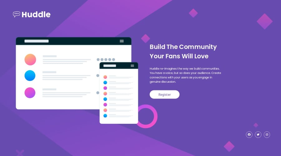
Design comparison
Solution retrospective
Good training
What challenges did you encounter, and how did you overcome them?Good training
What specific areas of your project would you like help with?Good training
Community feedback
- @Grimm-NPosted 5 months ago
Great job! I'm absolutely impressed by how responsive the design is! 👏 It looks really smooth across different screen sizes. Here are a few small suggestions to make it even better:
-
Use relative units instead of pixels – Try using
remoreminstead ofpxfor better scalability and accessibility. This makes the design more flexible and adaptable for different screen sizes and user preferences (like zooming). 📏 -
Use
clampfor adaptive font sizes – You can useclamp()to make your font sizes adjust fluidly depending on the screen width, ensuring the text remains readable on both small and large screens. For example:
font-size: clamp(1rem, 2vw, 1.5rem);
This approach is great for responsiveness! 📐 -
Consider using downloaded fonts – If you're using custom fonts, it's often better to download them (using
@font-face), instead of relying on web font services. This way, you control the loading speed and avoid dependency on third-party services. 📥
Keep up the great work! 🎉
1 -
Please log in to post a comment
Log in with GitHubJoin our Discord community
Join thousands of Frontend Mentor community members taking the challenges, sharing resources, helping each other, and chatting about all things front-end!
Join our Discord
