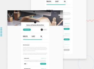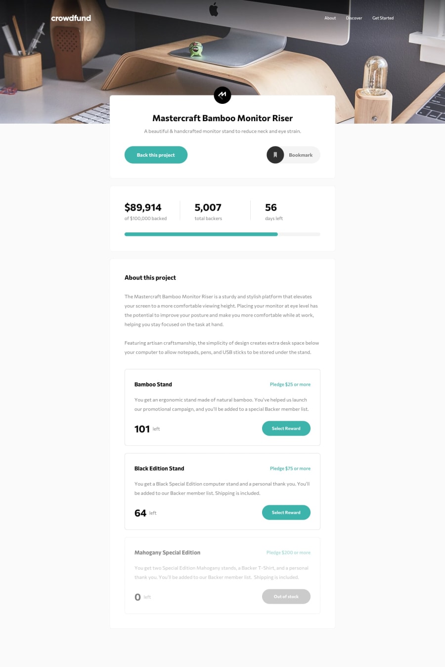
Design comparison
SolutionDesign
Solution retrospective
Hi, I would appreciate any advice or tips about the project in order to improve it :D a doubt, is it normal to use many lines of code in css, or do I really have a bad practice? I would be grateful if you could tell me that question :D
Community feedback
- @clarencejuluPosted about 2 years ago
Hello Reddsito, Your project is good and all functionalities work well. However, I noticed that your modal view doesn't match what was shown in the design.
I don't think you can easily achieve this with flex. You may have to change display to grid when the screen size is smaller and implement code similar to what I have pasted below
.modalBox{
  grid-template-areas:
    'circle heading heading heading'
    'description description description description'
    'amount-left . . .';
  grid-template-columns: 2.5rem 1fr 1fr 1fr;
}
Other than that, good job!
Marked as helpful0
Please log in to post a comment
Log in with GitHubJoin our Discord community
Join thousands of Frontend Mentor community members taking the challenges, sharing resources, helping each other, and chatting about all things front-end!
Join our Discord
