Submitted over 3 years ago
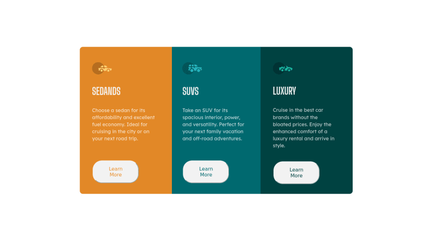
did this using vs code editor but couldnt so mobile friendly site
@naziakabri
Design comparison
SolutionDesign
Solution retrospective
can someone help me with no able to crack out mobile friendly site this time with @media only screen and (max-width:500px) but if already got into 1 row in each when you view it with the mobile how ?
Community feedback
- @Jorge644240Posted over 3 years ago
If you used Flexbox you can just write @media screen and (max-width: 500px) { .container { flex-direction: column; } .column { width: 100% } }
Marked as helpful0
Please log in to post a comment
Log in with GitHubJoin our Discord community
Join thousands of Frontend Mentor community members taking the challenges, sharing resources, helping each other, and chatting about all things front-end!
Join our Discord
