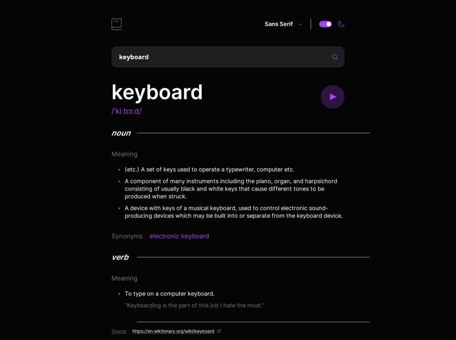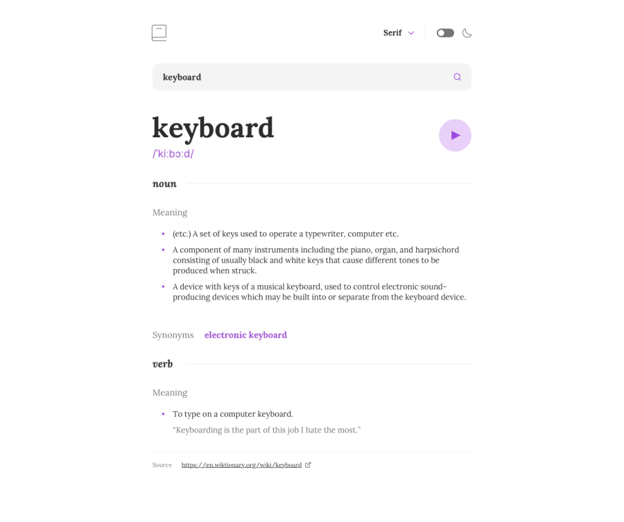
Design comparison
Community feedback
- @ortalyartsPosted 12 months ago
Hey @omarhmitoch!
Congratulations on completing the challenge!
I have a few suggestions for you:
-
The line divider (.partOfSpeech::before) is wider as it's container. You can fix it by setting it's width to
calc(100% - 80px). -
The search icon "jumps" to the bottom when error message appears. It is because you set it's position depending on the parent's height (.inputWrapper) in percentage. When the error message is shown, the parent is higher.
-
For some search terms (like "face") there is horizontal overflow and the horizontal scrollbar appears. The reason is the .synonyms container, when it has too many synonym words inside it and is too wide. You set it to
display:flex;just addflex-wrap: wrap;to fix the case. -
Try using semantic html. For example: include text contents in <p> or <h> elements, div / span elements are non-semantic. Read more about HTML Semantic Elements.
Other then this you did a good job on the development!
I hope you find this helpful! Cheers 🍭
Marked as helpful0@omarhmitochPosted 10 months ago@ortalyarts Thank you so much for the suggestions !! Definitely noted 🤝 I appreciate you taking the time.
0 -
Please log in to post a comment
Log in with GitHubJoin our Discord community
Join thousands of Frontend Mentor community members taking the challenges, sharing resources, helping each other, and chatting about all things front-end!
Join our Discord
