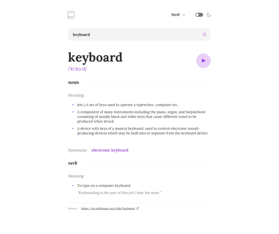
Design comparison
Solution retrospective
Really enjoyed building this masterpiece....
Community feedback
- @DivineUgorjiPosted about 1 year ago
Hello@ZainabProgrammer 👋 congratulations on completing this challenge 🙌
Your solution is nice and thoughtfully implemented ✅
-
It's responsive across multiple screen sizes 💻
-
Your code is semantic, well-structured, and readable. 💯
I really love your design implementation, and the API you used gives good details of the words searched. In fact, I'm bookmarking this project so I can reference the API later. 🚀
However, I have a few suggestions. The
home iconis just decorative, I think it would be a much better use case if it is used torefreshthe page for a fresh word search. Also, thesearch functionalityis triggered only when the search icon is clicked, I think the search functionality should also work when theEnter keyis pressed after inputting the search words.The application would have a much better user experience if these issues were corrected.
Overall, your solution rocks, and has excellent implementation.
Happy coding! 🙏
0 -
Please log in to post a comment
Log in with GitHubJoin our Discord community
Join thousands of Frontend Mentor community members taking the challenges, sharing resources, helping each other, and chatting about all things front-end!
Join our Discord
