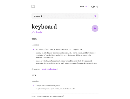
Dictionary web app with SolidJS

Solution retrospective
Hey there,
This is my solution to the dictionary web app challenge.
The application is built with SolidJS, TypeScript, and Vite. Styling is done through CSS Modules, which are supported by Vite out of the box.
Everything is completely responsive and supports the font toggle as well as dark mode. By default, the user's preference is taken into account, meaning that dark mode will be used if the user prefers that. Both the dark mode and font settings are persisted in the browser's local storage for when the user visits the app the next time.
One main focus of mine was accessibility; the dropdown, toggle, and input (including it's validation) are in accordance with WCAG 2.1 and the HTML is as semantic as possible.
Let me know what you think :)
Please log in to post a comment
Log in with GitHubCommunity feedback
No feedback yet. Be the first to give feedback on Andreas Remdt's solution.
Join our Discord community
Join thousands of Frontend Mentor community members taking the challenges, sharing resources, helping each other, and chatting about all things front-end!
Join our Discord