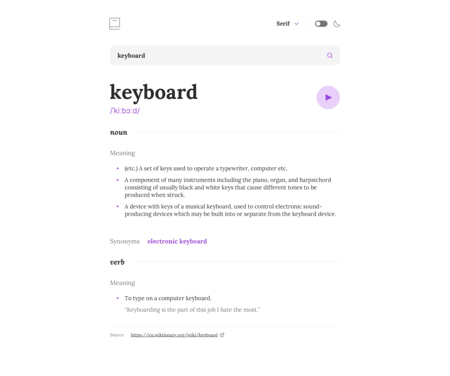
Design comparison
SolutionDesign
Solution retrospective
Hello everyone. I feel good on how I built this project. My only concern would be the dropdown. It doesn't look nice when it's fading out. It somebody knows a better way to handle I'm all ears.
It's under the <Header /> component.
Thanks in advance.
Community feedback
Please log in to post a comment
Log in with GitHubJoin our Discord community
Join thousands of Frontend Mentor community members taking the challenges, sharing resources, helping each other, and chatting about all things front-end!
Join our Discord
