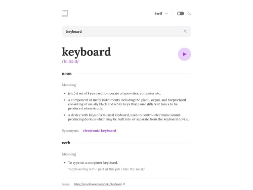
Design comparison
Solution retrospective
Hi everybody! This challenge was great for me to try new things. I wanted to see how Storybook works, this tool is fantastic for checking UI components separately and identifying accessibility issues easily. If you have any suggestions for improving this project, I would appreciate it!
Community feedback
- @SamHemingwayPosted over 1 year ago
Great implementation Juan!
I really like the use of determining state from the URL (something I've been wanting to learn for a while now, any good tutorials you can recommend?).
I really appreciate that you put in the work to add things like
aria-label
for unsighted users.I tested out your font selection drop down menu for keyboard accessibility, and at first glance it works great — kudos for the work you must have put in to trap keyboard focus, and that the selected font option is focused by default.
The only weird behaviour is the fact that the page moves as we use the up/down arrow keys to select an option - perhaps there's a way to disable that default behaviour of those keys when the dropdown is active?
Generally speaking, for things like the dropdown, I tend to turn to unstyled libraries like Radix UI as they're always bulletproof for annoying little things like this :)
Last UX point: the only way to submit the form is by pressing enter, which might not be immediately obvious for anyone using it for the first time. A lot of users might expect a submit/search button that sends the form - I discovered this when I asked my partner to test my solution, and watched as she got confused after entering text on what to do next!
Keep up the great work buddy!
Marked as helpful0@juanpb96Posted over 1 year agoThanks for commenting, Sam! 😃
Regarding the URL state, I've used the
pathname
of theuseLocation
hook from react-router-dom. You can create your own custom logic to handle specific states. If you want to dig deeper into it, check out this page which I found quite useful.I really appreciate the fact that you took the time to review the accessibility aspects of my project. Improving accessibility is something I consider to be a valuable skill.
Wow, I hadn't actually noticed that behavior until you brought it up 😯! Thanks for pointing it out. I'll definitely take a closer look into Radix UI since it seems to have some powerful features. To address the issue for now, I'll make sure to include an event listener that prevents the default behavior of the arrow keys when the dropdown is active.
When it comes to submitting the search term, I noticed that you've handled it by executing the search while the user is typing, and it looks amazing btw. However, I would like to try something different, as you mentioned there should be a prompt or instruction for the user regarding what to do next.
0
Please log in to post a comment
Log in with GitHubJoin our Discord community
Join thousands of Frontend Mentor community members taking the challenges, sharing resources, helping each other, and chatting about all things front-end!
Join our Discord