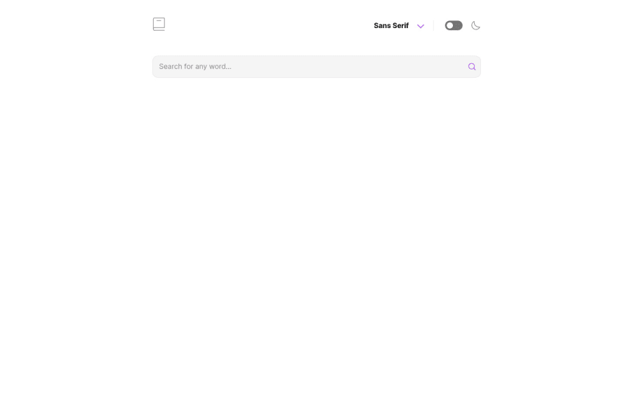


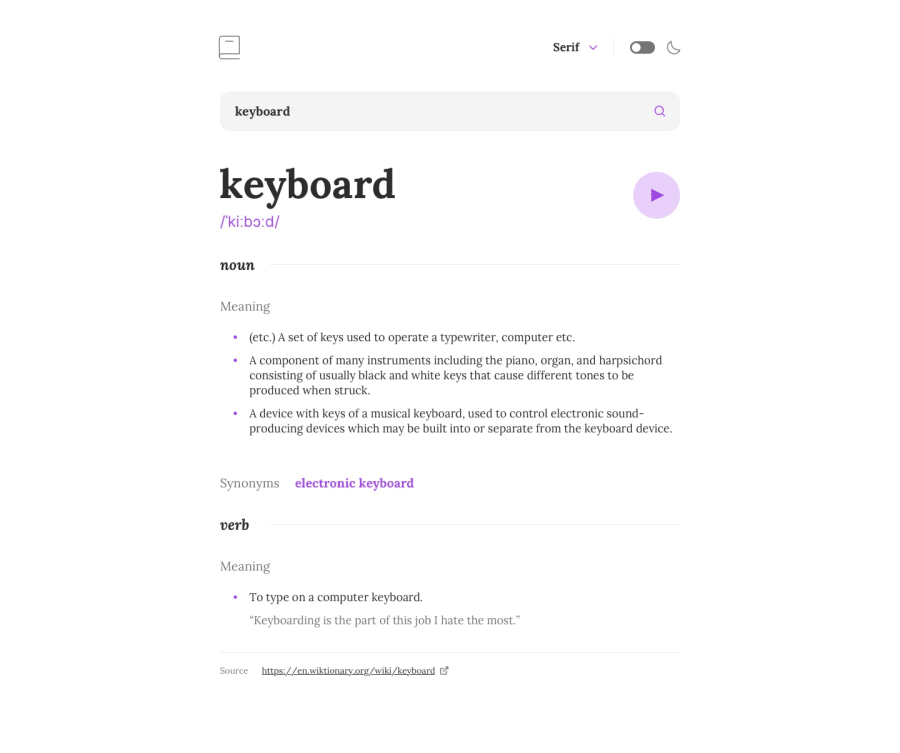
Design comparison
SolutionDesign
Solution retrospective
Hi, I'm quite proud of my work, but personal pride is always based on self-esteem, so asking someone's opinion is what I want from you, so I can improve where I have to improve. Please, give me a feedback what you think through the comments and also the like, so I know the level of approval. thanks.
Community feedback
- @web-dev-samPosted about 2 years ago
Great Solution!!! Here are some things you could improve:
- The dark mode toggle doesn't seem to do anything when I click on it.
- When you click on the font changer a dropdown appears. You could make that dropdown disappear whenever a user clicked outside of it.
- You could also make the purple shadow of the dropdown more blurry (bigger).
- I love what you did with the play sound button. To make it even better you could make the animation smoother and slower in a breathing kind of style.
Keep it up and happy coding 😁
0

Please log in to post a comment
Log in with GitHubJoin our Discord community
Join thousands of Frontend Mentor community members taking the challenges, sharing resources, helping each other, and chatting about all things front-end!
Join our Discord