Dictionary Web App challenge solution with ReactJS


Design comparison
Solution retrospective
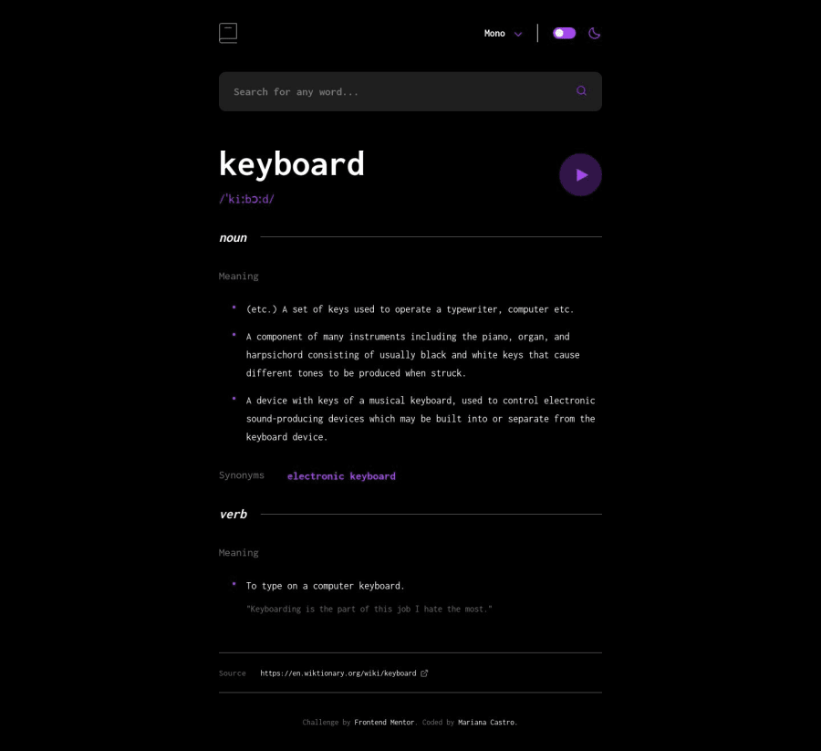
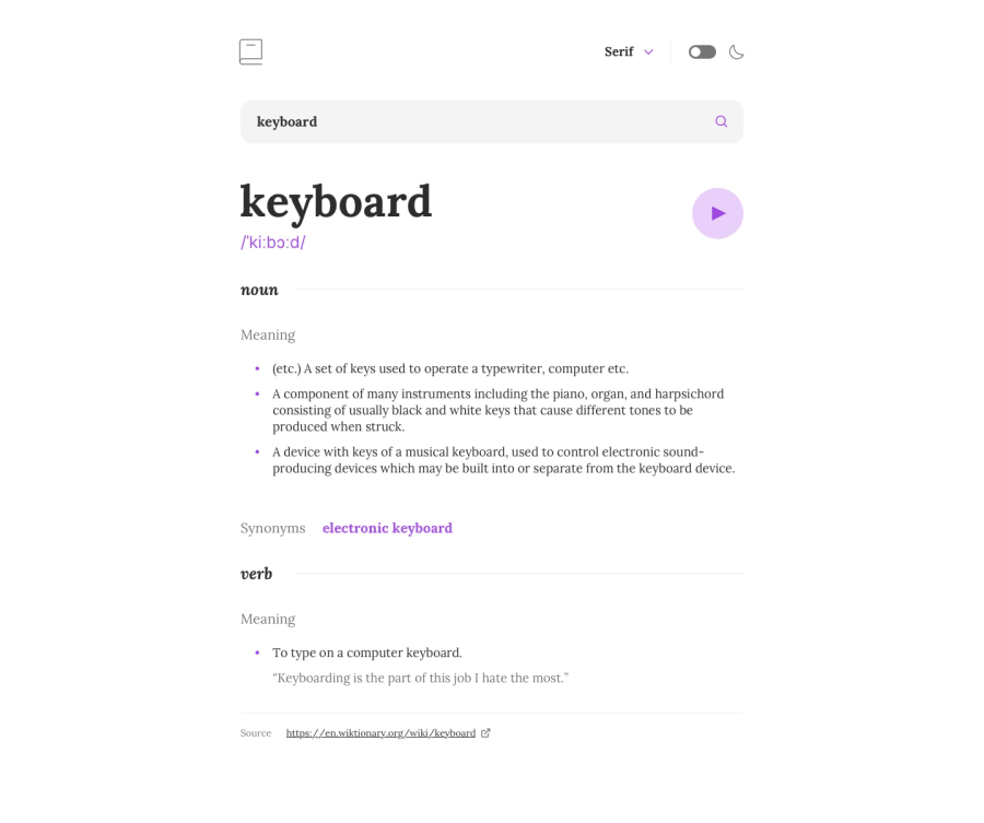
In this project, I had the opportunity to exercise componentization with ReactJS to the fullest, making the application more readable and facilitating its maintenance. I also made use of styled-components, favoring adherence to best practices for controlling a component's behavior.
I'm a little unsure about how the API handles data in case of an error. As I've articulated it in my application, I'm manually specifying the phrases that should be displayed in case of an error, rather than directly getting the "date" attributes. Any suggestions to better deal with this issue are totally welcome!.
Community feedback
- @towkirPosted over 1 year ago
Looks pretty cool, congratulations on completing the challenge. Would love to point out a few things that kept it from being a perfect one.
- I feel like there is a bit of margin on the list items of the word meanings you can review it with the design.
- The font selector makes a jump once you choose a font, let's try to keep that right aligned and always on the same place.
- The selector is opened and if we click on any other place outside the dropdown, it should be hidden.
- We should make more descriptive and smaller commits on git.
Hope this would help, loved your efforts, it is really a nice project. Cheers
Marked as helpful1@maricastrocPosted over 1 year ago@towkir Thank you so much! Your feedback will definitely help me a lot to improve this application. And thank you for your kind words as well. 😊
0 - @Kamlesh0007Posted over 1 year ago
Congratulations on completing the challenge! Your hard work and dedication are truly admirable. As you continue to hone your skills, here are a few suggestions that may be helpful:
Keep practicing and learning new things. The more you challenge yourself, the more you'll grow as a developer. Seek feedback from others. It's always helpful to get a fresh perspective on your work and learn from constructive criticism. Collaborate with other developers. Working with others can help you learn new techniques and improve your coding skills. Again, congratulations on completing the challenge, and I wish you continued success in your coding journey! 😁
Marked as helpful1@maricastrocPosted over 1 year ago@Kamlesh0007 Thank you so much for your feedback! 😃
0


Please log in to post a comment
Log in with GitHubJoin our Discord community
Join thousands of Frontend Mentor community members taking the challenges, sharing resources, helping each other, and chatting about all things front-end!
Join our Discord