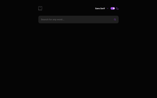
Design comparison
Solution retrospective
Hi. After a long time I post this solution. It took me a little bit longer due to the things happening in my life, but I will finally post it. Started it with testing, but later abandoned it. Worked on it a little each week. It will certainly have some bugs and issues, so if you find one let me know. Feedbacks are welcome. Have a nice day.
Community feedback
- @DivineUgorjiPosted about 1 year ago
Hello there, congratulations on completing this challenge.
I really love your design implementation, it looks really lovely. However, the home icon gives a 404-page error, and the theme toggle switch is not working. The solution would be much better if you correct those issues.
once again, excellent implementation. Happy coding!
Marked as helpful1@karolbanatPosted about 1 year agoHi @DivineUgorji, thanks for the nice comment. Fixed the issue with home icon and changed the implementation of the theme switch. Before I implemented it with radio buttons, so you had to click on hidden buttons to make it work, but after reading your comment I changed it to regular button with role of 'switch'. Thank you for checking the solution. Have a nice day 😊
1 - @jonathan401Posted about 1 year ago
Congratulations @Karol on completing this challenge 🎉🎉. The solution looks great on my mobile device. I hope everything works out fine with you too.
1@karolbanatPosted about 1 year agoHi, @jonathan401. Thanks for checking my solution on mobile device and for your kind words. Have a nice day 😊
1
Please log in to post a comment
Log in with GitHubJoin our Discord community
Join thousands of Frontend Mentor community members taking the challenges, sharing resources, helping each other, and chatting about all things front-end!
Join our Discord