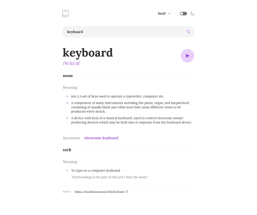
Design comparison
SolutionDesign
Solution retrospective
The project was very interesting to complete, I tried to make this look exactly like the design as much as I could, but I came up with some questions.
- Should we not show a pause button when a user has started playing an audio for a word ? (Though I've added one to mine, totally with css)
- I used the
preferred-color-schemeto automatically set the theme as per system pref, but I found a flash of white screen initially, since retrieving this information takes a liiittllee bit of time. Please let me know if anyone knows a way around this.
Community feedback
Please log in to post a comment
Log in with GitHubJoin our Discord community
Join thousands of Frontend Mentor community members taking the challenges, sharing resources, helping each other, and chatting about all things front-end!
Join our Discord
