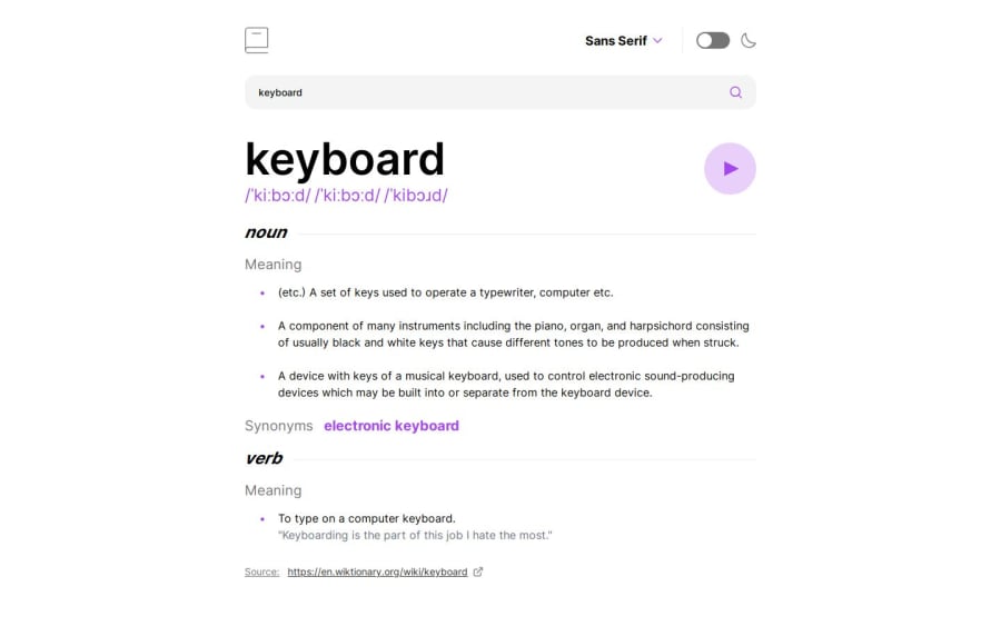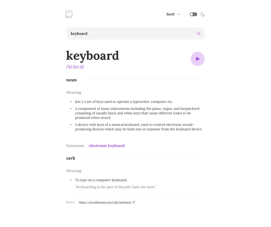
Dictionary web app
Design comparison
Solution retrospective
I've followed the figma model perfectly, and I've paid particular attention to accessibility and responsiveness.
What challenges did you encounter, and how did you overcome them?I had no great difficulty developing the application. Firstly because the data structure returned by the api isn't complex, but also because some time ago I'd done it in HTML, CSS and JS but hadn't published it. The layout of the elements on the page wasn't obvious at the time. I'd had to experiment a lot with grid and flex approaches. Here, I had more or less an idea of how to do it better. I cut the elements into smaller components. I really enjoyed doing it😁.
What specific areas of your project would you like help with?Honestly nothing, but I know that everything can be perfected, so if there's a better approach to the way I've done it, I'll take it from you who read me and take the trouble to consult the code I've delivered to express it to me. I'm open to suggestions. That's how we learn and become better😃.
Community feedback
Please log in to post a comment
Log in with GitHubJoin our Discord community
Join thousands of Frontend Mentor community members taking the challenges, sharing resources, helping each other, and chatting about all things front-end!
Join our Discord
