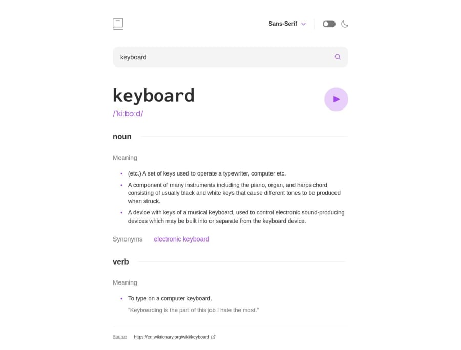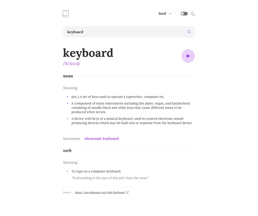
Dictionary Application Built with React & TypeScript, and SWR
Design comparison
Solution retrospective
Hello, this is my solution to the dictionary application built with React, TypeScript, SWR, and Styled-Components. End-to-end testing handled with the Cypress testing library.
Any feedback on my project organization, testing practices, and performance would be greatly appreciated.
This project gave me a better understanding on how to use the SWR library to make http request in client components in React. I've used other libraries such as React-query before, so getting experience with other another tool was a great learning experience.
The Axios library is used to make the HTTP request in the fetch function that is called by the `useSWR' hook .
Thank you for viewing my solution, happy coding!
Community feedback
- @andreasremdtPosted almost 2 years ago
Hey @JorgeAMendoza,
Great job on this challenge! I played around with it and everything works as expected. I especially love the fact that you wrote good E2E test coverage and used ESLint and TypeScript. Your code is very organized and clear, the folder structure and naming are consistent and sensible. I also noticed your attention to accessibility, which is appreciated. So, very well done :)
I found a couple of minor things you might want to fix, but these are only little details:
- The theme and font choice are not remembered in the browser. If I refresh after switching to dark mode or another font, it's back to default. Persisting the user's choice in local storage would be a nice addition.
- While the audio playback works fine, you could think about adding a "play" state, which disables the button and renders a different icon, like a spinner.
- Some fonts are not set correctly. For example, if you select the serif font, the main heading is still set to monospace. Additionally, the font dropdown doesn't have the right font families.
- Inside
font-context.tsx, you are using 2 contexts. If you don't think that this is necessary, you can have the font value and setter function on the same context and avoid the overhead. - You wrapped the search input inside a label, but the label doesn't have any text content. While technically speaking this is not an error, you can omit the label and rely on
placeholderandaria-label. It's usually an UX anti-pattern to not have a label, but since the design is this way there's nothing us developers can do...
Not an issue, just a tip: you implemented your own solution for the font dropdown, which is really good. For the future, I highly recommend using a headless library such as Headless UI or Radix UI. These libraries make it incredibly easy to build such components, because in reality it's quite hard to cover all bases (accessibility, keyboard navigation, edge collision, etc.).
Keep up the great work and let me know if you have any questions :)
Marked as helpful1
Please log in to post a comment
Log in with GitHubJoin our Discord community
Join thousands of Frontend Mentor community members taking the challenges, sharing resources, helping each other, and chatting about all things front-end!
Join our Discord
