Submitted over 1 year ago
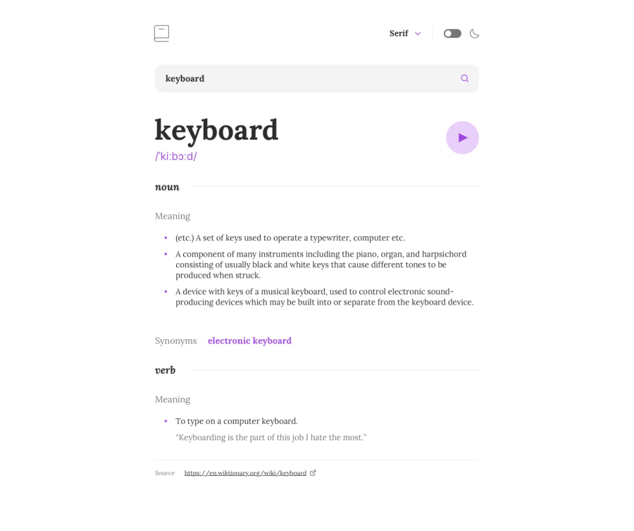
Dictionary app created with React, styled components, axios library
@Kristiana12
Design comparison
SolutionDesign
Community feedback
- @towkirPosted over 1 year ago
Looks awesome. Loved the way you organized git commits. Some feedbacks though:
- There is a purple rectangle on focus of some clickable elements, such as the font selector down arrow and the audio player icon, probably you considered accessibility through keyboard but you can use
focus-visiblefor that, this way, the border is only visible while navigating through keyboard and mouse click would keep the UI cleaner. - When the dropdown is open, if you click outside the dropdown and anywhere else in the page, the dropdown can be closed, it feels better.
- The font names can be rendered in the corresponding font families, such as serif option rendered in the serif font and the mono option in monospace font.
- Apparently the font's that you tried to render is not being rendered because they're not linked properly, you kept them in the project directory but the project still doesn't know those fonts by their name, hence the fallback generic fonts are being rendered on my machine, probably it looks fine at your end because you might have them installed in your pc, you can have e look here
- Maybe don't clear the search box value after fetching the results.
- When the red border is visible in search box, if you click search, the purple border on the search icon collides with the red border.
These are the things I thought could be improved on your next version. Cheers !!
Marked as helpful0@Kristiana12Posted over 1 year agoHey @towkir!
Thank you very much for your feedback! I appreciate you taking the time to look at my solution.
As for the fonts I linked them through CSS with @font-face. On my developer tools > Network, they show up as if they are loading when I change the font.
Going to try and improve it :)
0@towkirPosted over 1 year ago@Kristiana12 you're right. For some reason, I see this when I select the mono font, the other two seems okay.
0 - There is a purple rectangle on focus of some clickable elements, such as the font selector down arrow and the audio player icon, probably you considered accessibility through keyboard but you can use
Please log in to post a comment
Log in with GitHubJoin our Discord community
Join thousands of Frontend Mentor community members taking the challenges, sharing resources, helping each other, and chatting about all things front-end!
Join our Discord
