Design comparison
SolutionDesign
Solution retrospective
What are you most proud of, and what would you do differently next time?
So far, I'm able to design the webpage faster now compare to before, with little difficulties along the way. But there's definitely there's cleaner and more efficient code out there so ye.
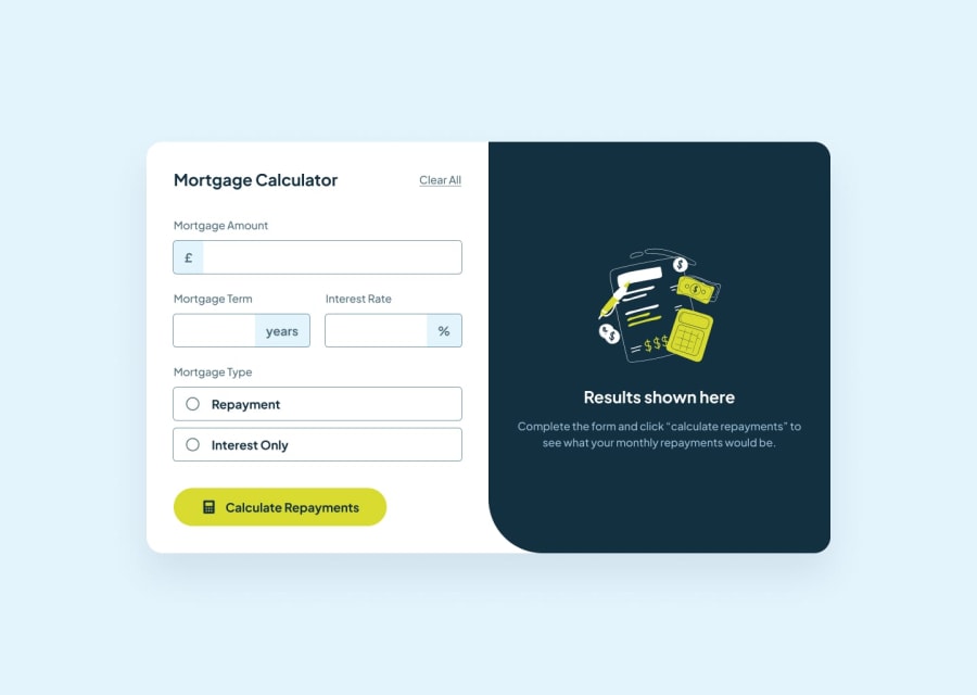
What challenges did you encounter, and how did you overcome them?Definitely the years, currency, and percent sign inside the inputs. Idk if there's a feature of inputs where you can insert some indicator. I had to use position absolute in order for them to go inside the input, then adjust it based on screen size. Very tedious thing to do so if there's a better and easier way of doing it, will glad to know it :)
What specific areas of your project would you like help with?The years, currency, percent sign one!!
Community feedback
Please log in to post a comment
Log in with GitHubJoin our Discord community
Join thousands of Frontend Mentor community members taking the challenges, sharing resources, helping each other, and chatting about all things front-end!
Join our Discord
