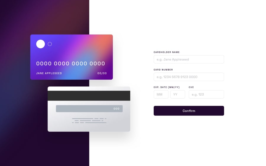
Design comparison
Solution retrospective
I'm actually proud that I was able to learn position absolute and some JS code as well. Though I noticed that my codes are maybe repetitive (to me it's the easiest approach) so it might not be efficient and scalable. So I would try to do it differently next time.
What challenges did you encounter, and how did you overcome them?Trying to make the position absolute divs responsive. I was trying to make the cards in the center despite changes in the screen size, but it's not possible because I'm using left/top/bottom for their position. So, I just used media queries to adjust it's position, meaning, as you increase it's width size, it won't always be 100% aligned properly .
What specific areas of your project would you like help with?Maybe more efficient code, or tips and tricks.
Community feedback
Please log in to post a comment
Log in with GitHubJoin our Discord community
Join thousands of Frontend Mentor community members taking the challenges, sharing resources, helping each other, and chatting about all things front-end!
Join our Discord
