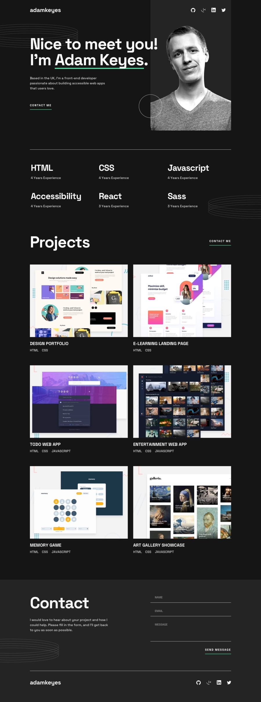
Design comparison
Solution retrospective
Hey there!
I recently completed the Single-page developer portfolio challenge on Frontend Mentor, and I'm seeking feedback on my solution. I'm excited to share my progress and learn from experienced developers like you.
One aspect I found challenging was implementing the form validation functionality. Ensuring that all fields were validated correctly and displaying appropriate error messages required careful consideration. Another difficulty was achieving the optimal layout for different screen sizes. It took some effort to create a responsive design that looked good on mobile and desktop devices. Additionally, I added a three-column layout for the project section.
I am unsure if my form validation implementation is the most efficient and effective way to validate the input fields. I would appreciate feedback on whether there are better approaches or potential improvements.
I would like to know if there are any best practices I may have overlooked while implementing the form validation or any other aspect of the project. I am also curious about any suggestions for optimizing performance or improving the code structure to make it more maintainable and scalable.
Thank you in advance for any feedback! Happy coding everyone!
Community feedback
Please log in to post a comment
Log in with GitHubJoin our Discord community
Join thousands of Frontend Mentor community members taking the challenges, sharing resources, helping each other, and chatting about all things front-end!
Join our Discord
