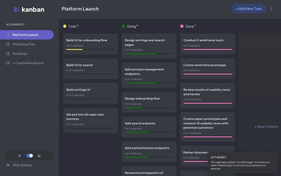
Developed Kanban using React, Typescript, Zustand and RadixUi
Design comparison
Solution retrospective
Creating a functional and attractive Kanban site: I managed to implement all the necessary functions while maintaining an aesthetic and user-friendly interface.
Successful integration of Zod and UseFormHook: Careful work on the integration of these libraries allowed us to ensure smooth work with forms and data validation.
Accessible Design: The use of Radix and extensive testing ensured that the site was accessible to users with disabilities.
Theme Switching: Implement the feature of switching between light and dark theme without compromising performance and usability.
What challenges did you encounter, and how did you overcome them?Difficulties:
- Zod and UseFormHook Integration: Both libraries are designed to work with forms, which required careful integration to ensure smooth operation.
- Accessibility: Creating inclusive UI components using Radix required extensive testing and ensuring compliance with WCAG standards.
- Themes: Implementation of switching between light and dark theme without compromising performance and usability.
Overcoming:
- Zod and UseFormHook: A thorough study of the documentation and code examples of both libraries allowed us to find solutions for their effective integration. The use of hooks and function composition promoted modularity and code reuse.
- Accessibility: Regular testing with accessibility tools and use of accessible Radix components ensured WCAG compliance.
- Topics: Using CSS variables and media queries made it possible to change the color scheme of the entire site with minimal coding. Careful performance optimizations ensured smooth switching between themes.
Enhancing the project:
- Clarity and conciseness: Ensure your description is clear, concise, and easy to understand for a non-technical audience.
- Highlighting key features: Emphasize the most impactful features and functionalities of your project.
- Quantifying achievements: Use metrics and data whenever possible to demonstrate the success of your project.
- Tailoring to the audience: Adapt your description to the specific interests and expectations of your target audience.
Community feedback
Please log in to post a comment
Log in with GitHubJoin our Discord community
Join thousands of Frontend Mentor community members taking the challenges, sharing resources, helping each other, and chatting about all things front-end!
Join our Discord
