Design comparison
Solution retrospective
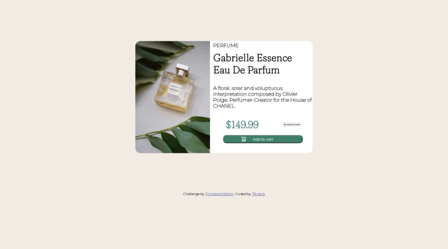
Surely I encountered some problems. But the hardest thing was adjusting the size of an image. When I applied the css grid on the content of my page, the img took up a lot of space and reconstructing it with the CSS was not easy for me. In addition, when I used media querie to code the part mobile, I did not know how to replace the image of the desktop with that of the mobile that exist in the image folder. So I had to leave the first img only. Thank you for you attention and for reading my code.
Community feedback
- @red-jpoPosted over 1 year ago
Congratulations on completing the challenge! Your use of grid is a good start and with some improvement, it can become even better.
The desktop layout seems to be your main one and I have some suggestions that may help you improve your design. You might want to consider using flex on the body element to center your card in the viewport. This will give your design a more polished and professional look. However, keep in mind that doing so may cause your footer to move around. To fix this, you can set its position to absolute and give it a fixed height. Like this:
body{ display: flex; align-items: center; justify-content: center; height: 100vh; } footer{ position: absolute; bottom: 0; height: 10vh; }
Another issue is that your text column seems to get very squished while the image remains the same size. To solve this, consider putting all the elements of the text column into a single div and giving the image its own div. You can use multiple rows inside the text column to adjust the content. Placing both the image div and the text div inside a single container, similar to what you have, and adjusting its width might also help with sizing issues.
Implementing these suggestions will require adjustments in other areas of your code, but they are a good starting point for improving your design. Keep up the good work and continue to improve your skills.
Marked as helpful0@Tfk-teckPosted over 1 year ago@red-jpo. I have read your suggestions and advice. I will try to apply them soon. Thank you for your help, you are helpful .
0 - @peanutbutterjllyPosted over 1 year ago
Hey 👋,
I've seen @0xAbdulKhalid suggest a very helpful hint before regarding using the picture tag with a media query build into source tags nested in there.
when I did the challenge I kinda rushed through it and didn't even realize there were different images 😬 - so, like you, I ended up just using the same image for both desktop and mobile
Here's a helpful link regarding the picture tag and setting the media attribute in there:
Good job on your solution!
Marked as helpful0@Tfk-teckPosted over 1 year ago@peanutbutterjlly. Thank you for the information. I didn't know about the attribute "media". The link you gave me is very helpful. That's a really good tip 👍
1
Please log in to post a comment
Log in with GitHubJoin our Discord community
Join thousands of Frontend Mentor community members taking the challenges, sharing resources, helping each other, and chatting about all things front-end!
Join our Discord