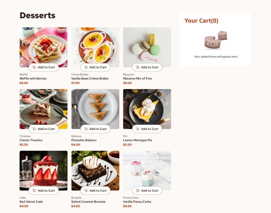
Design comparison
Solution retrospective
I did some more learning to understand why framer motion wasn't doing the exit animation
What challenges did you encounter, and how did you overcome them?not really any challenges, it was quite straight forward. just took time to implement. I did this in about a day.
What specific areas of your project would you like help with?I want to know how to make the clickable elements more keyboard accessible. using button and having divs as a child component is not valid
Community feedback
- @TedJenklerPosted 3 months ago
Hi @edwinc73,
Nice project! I have some feedback regarding how you can approach button creation:
Okay, so there are two ways to approach this. The first is the hard but fun way: you create a button and then place content inside it using absolute positioning. It’s really enjoyable, but it can be a bit frustrating at times and arguably just a waste of time haha(You will learn a lot trying to solve this but don't use this as a real solution).
The second, and more practical, approach is to create a custom button using <div> elements. To ensure accessibility, you should:
Add role="button" to indicate it's an interactive element.
Use tabindex="0" to make it focusable via keyboard navigation.
Add aria-pressed="false" (or aria-pressed="true", depending on the state) to communicate its state to screen readers. Here's a quick example:
<div role="button" tabindex="0" aria-pressed="false" onclick="handleClick()" onkeydown="if(event.key === 'Enter') handleClick()" style={} Custom Button </div> This approach ensures that your custom button is both functional and accessible. It’s easier to manage and maintain, especially in complex projects. (It is the correct way.)Keep up the great work!
Best, Teodor
Marked as helpful1@edwinc73Posted 3 months ago@TedJenkler, Thanks for your comment. In the future projects I will the 2nd approach. Currently I just removed the unnessesary divs within the button
1 - @SvitlanaSuslenkovaPosted 3 months ago
You can just add grid to the button and not create div inside it.
Marked as helpful0@edwinc73Posted 3 months ago@SvitlanaSuslenkova Thank you! I have fixed this now by just removing the divs and moving the styling to the buttons instead. I seems like i make this error a lot. I have also fixed the issue of nested buttons.
0
Please log in to post a comment
Log in with GitHubJoin our Discord community
Join thousands of Frontend Mentor community members taking the challenges, sharing resources, helping each other, and chatting about all things front-end!
Join our Discord