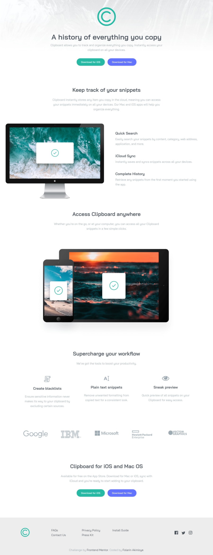
Design comparison
Solution retrospective
Please check the responsiveness and my code base.
What am I doing wrong?
And does this look like a professional work? Kindly rate my implementation over 10.
Thanks!
Community feedback
- @grace-snowPosted almost 4 years ago
Design-wise this looks excellent! You've done a really good job. I've not got time to delve into the code right now, but just from previewing on mobile this looks brilliant.
Only really tiny things I might tweak:
- center aligning text on the quick search etc 3 blocks for just a little longer as you increase screen width so they are centred when mobile landscape
- increasing line height slightly on paragraphs so they're like the design
Good job! 👍
2 - @ApplePieGiraffePosted almost 4 years ago
Hey, Folarin Akinloye! 👋
It's good to see you complete another challenge! 😀 You've done a nice job on this one! 👏 Your solution looks good and responds nicely! 🙌
A few things I suggest are,
- Turning the social media icons in the footer of the page into links using the anchor tag.
- Allowing the background image in the hero section of the page to fill up the entire area of the screen (even when the screen width increases for large screens).
- If you want to use a
<section>tag for the company logos section of the page, you should probably add a hidden heading to it or something in order to identify that section and clear up the error on your solution report. - From a quick look at your class names for the sections, I think there's usually just one hero section on a page, and the rest of the sections might be a little better named after their content (like "section-features" or "section-cta" or something). It just might help you or others better identify each section based on what's inside it.
Hope those few tips help. 🙂
Of course—keep coding (and happy coding, too)! 😁
1@folathecoderPosted almost 4 years ago@ApplePieGiraffe Thanks Legend! 😇
I will definitely make necessary adjustments and improve my coding skills!
Thank you!
1 - @folathecoderPosted almost 4 years ago
Thank you Grace! 🙂 I will make necessary adjustments!
0
Please log in to post a comment
Log in with GitHubJoin our Discord community
Join thousands of Frontend Mentor community members taking the challenges, sharing resources, helping each other, and chatting about all things front-end!
Join our Discord
