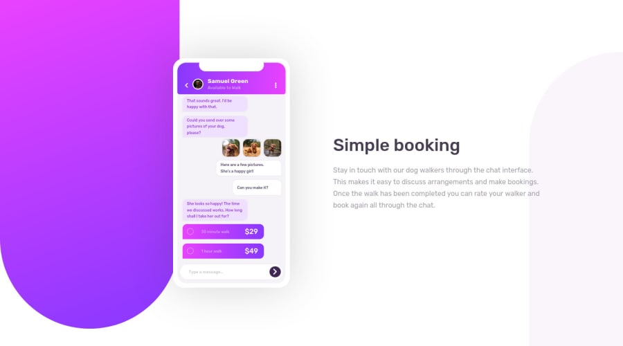
Desktop-First Using SCSS, FlexBox, CSS GRID
Design comparison
Solution retrospective
This challenge looked very simple before I attempted it. I laughed in my "evil villain" ๐ voice when I saw the "intermediate" tag.
I thought it was a mistake!
I was wrong! ๐
Building the illustration app alone tested my CSS skills. It was hard, in a fun way!
Please rate my implementation and suggest how I can improve!
Community feedback
- @ApplePieGiraffePosted over 3 years ago
Hello, Folarin Akinloye! ๐
Nice job on this challenge! ๐ It's good to hear that you enjoyed creating it! I've definitely underestimated the difficulty of a challenge before, too!
Overall, your solution looks good and responds pretty wellโthere's just a second vertical scroll bar that appears when the width of the screen decreases in the desktop layout that you might want to get rid of.
And it looks like only half of the background shape on the left of the page is visible when the width of the screen increases in the desktop layoutโmaking that a complete background shape would improve the look of the design, I think. ๐
As always, keep coding (and happy coding, too)! ๐
1@folathecoderPosted over 3 years ago@ApplePieGiraffe Thank you so much APG! I didn't notice earlier probably because of my screen, I will look into that.
Thanks๐
1@ApplePieGiraffePosted over 3 years ago@folathecoder
NP! Keep going with these challenges! ๐
1@folathecoderPosted over 3 years ago@ApplePieGiraffe Hey APG, check out the animation I added to the illustration, I used animate.css library to execute it.
1@ApplePieGiraffePosted over 3 years ago@folathecoder
Oh hey, that's cool! ๐ Animate.css is such a nice little library and it really does add some extra spice to an otherwise somewhat lifeless site! ๐ Nice work! ๐
1
Please log in to post a comment
Log in with GitHubJoin our Discord community
Join thousands of Frontend Mentor community members taking the challenges, sharing resources, helping each other, and chatting about all things front-end!
Join our Discord