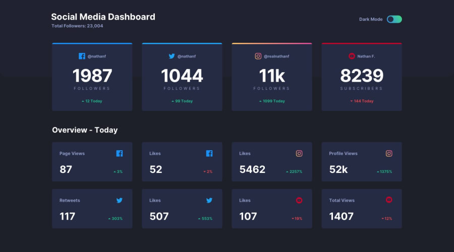
Design comparison
Solution retrospective
It was quite a challenge, but I enjoyed myself 😀
There are a couple of issues I noticed after I finished though:
- If you observe close enough, you can still notice the right-, bottom- and left-edge of the overall status cards still have the faint color of the border when ideally, they should not be there.😓
- I would like to 🤬 my iPhone X for having the notch. Because of that, I now have two white bars on the sides of my site. I skimmed a bit and read that you could change the meta tag inside <head> to change this kind of behavior, but that's something I would probably explore in the near future.🤔
In any case though, any feedback is appreciated! 👍
Community feedback
- @ApplePieGiraffePosted over 3 years ago
Hey, Anh Tran Duc! 👋
Good job on this challenge! 👏 Your solution looks good and is responsive! 😀 It's good to hear that you had fun completing this challenge! 😆
One or two small things I'd like to suggest are,
- Adding
overflow-x: hiddento thebody(or something similar) to prevent a horizontal scroll bar from appearing along the bottom of the page at certain screen sizes. - Making the light/dark theme toggle-switch keyboard-accessible.
- Adding the hover state from the original design to the cards on the page.
Another way you can add the colored borders to the top of the cards (without having slivers of the border peek through around the other edges of the cards) is to use CSS pseudo-elements to do so. That's what I did in my solution to this challenge, and I think it worked out fairly well. If you'd like to learn more about pseudo-elements and how to use them, this video can help you get started.
Hope that is helpful. 🙂
Keep coding (and happy coding, too)! 😁
0 - Adding
Please log in to post a comment
Log in with GitHubJoin our Discord community
Join thousands of Frontend Mentor community members taking the challenges, sharing resources, helping each other, and chatting about all things front-end!
Join our Discord
