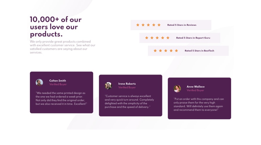
Design comparison
SolutionDesign
Solution retrospective
On the line with stars, I used span containing img star, I realized that img star not in span. I tried so hard to fix but I can't. Hope to receive your feedback.
Community feedback
- @ApplePieGiraffePosted about 4 years ago
Hey, Diem Thuy Huynh! 👋
Nice job on this challenge! It looks good and responds well! 👍
In addition to rfilenko's feedback, I suggest,
- Setting the
text-alignproperty of the heading and subheading tocenterin the tablet and mobile layouts of your page. - Perhaps adding a wee bit of padding to the sides of the page in the mobile layout so that there's some space between the content and the edges of the screen.
Keep coding (and happy coding, too)! 😁
1@tmeidPosted about 4 years ago@ApplePieGiraffe thanks for your feedback. So helpful ^^~ .
0 - Setting the
- @rfilenkoPosted about 4 years ago
Hey, good job. Have a few tips for you:
- .intro > ul > li > span > span - don't use some many selectors to target elements in css, usually one class is enough;
- not sure what the issue is with the stars - would probably just use imgs or spans in a list (img as background).
- you can try mobile-first approach on next project.
Also you can look into sass or css variables. 😉 Cheers, Roman
1@tmeidPosted about 4 years ago@rfilenko Your tips are so useful for me. Thank you very much, I'd work on that ^^
0
Please log in to post a comment
Log in with GitHubJoin our Discord community
Join thousands of Frontend Mentor community members taking the challenges, sharing resources, helping each other, and chatting about all things front-end!
Join our Discord
