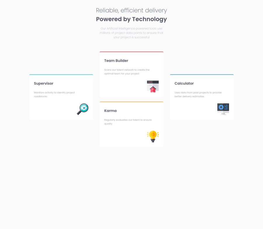
Design comparison
SolutionDesign
Solution retrospective
Maybe not my best code so far, would be awesome some code review and any transform:translate tip/trick. After my fourth done challenge finally i'll start with some Javascript, wish me luck. Love u all!
Community feedback
- @palgrammingPosted over 3 years ago
you solution looks good the only thing you could add is a middle layout a 2 column 2 card layout. If you look at your results in a browser 1000px wide you can see all the white space around the current single row of cards
0@SintaxisDevPosted over 3 years ago@palgramming yeah, it's a good idea. Anyways, I did it quite fast cause i wanted to start with Javascript. Maybe i'll make it again later. Thanks for the idea!
0
Please log in to post a comment
Log in with GitHubJoin our Discord community
Join thousands of Frontend Mentor community members taking the challenges, sharing resources, helping each other, and chatting about all things front-end!
Join our Discord
