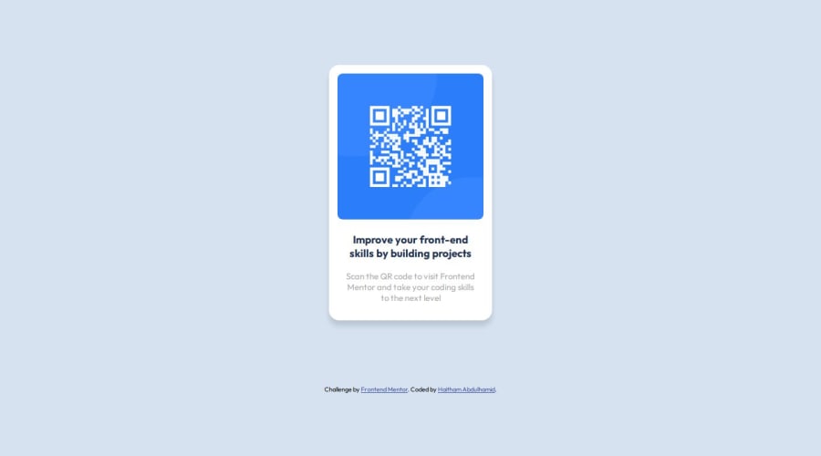
Desktop-First Responsive QR Code Component(Vanilla CSS and HTML)
Design comparison
Solution retrospective
I wrote the solution with barely any external help (Google, etc.), and the knowledge I learned(from a course) was somewhat retained in my head. I would definitely try using reusable classes instead of just writing all the styling in one class.
What challenges did you encounter, and how did you overcome them?Implementing media queries. I revised what I wrote in a previous project, and it immediately clicked.
What specific areas of your project would you like help with?Definitely in code organization, mainly determining a spacing system and also width and height optimizations.
Community feedback
- @danielmrz-devPosted 8 months ago
Hello, @Leo-yagami!
Your project is looking fantastic!
I'd like to suggest a way to make it even better:
- Using
margin
isn't always the most effective method for centering an element.
Here's a highly efficient approach to position an element at the center of the page both vertically and horizontally:
📌 Apply this CSS to the body (avoid using
position
ormargins
in order to work correctly):body { min-height: 100vh; display: flex; justify-content: center; align-items: center; }
I hope you find this helpful!
Keep up the excellent work!
Marked as helpful2 - Using
- @Islandstone89Posted 8 months ago
HTML:
-
Every webpage needs a
<main>
that wraps all of the content, except for<header>
andfooter>
. This is vital for accessibility, as it helps screen readers identify a page's "main" section. Wrap the card in a<main>
. -
Always include an
alt
attribute on images! Decorative images should have empty alt text(alt=""
), but this image has meaning, so it must have proper alt text. Write something short and descriptive, without including words like "image" or "photo". Screen readers start announcing images with "image", so an alt text of "image of qr code" would be read like this: "image, image of qr code". The alt text must also say where it leads(frontendmentor website). -
Headings should always be in order, so you never start with a
<h3>
. Change it into a<h1>
. -
.attribution
should be a<footer>
, and you should use<p>
for the text inside.
CSS:
-
Including a CSS Reset at the top is good practice.
-
Add around
1rem
ofpadding
on thebody
, so the card doesn't touch the edges on small screens. -
Remove the margin on the card.
-
To center the card horizontally and vertically, use Flexbox on the body:
display: flex; flex-direction: column; justify-content: center; align-items: center; min-height: 100svh; gap: 2rem;
The
gap
is used to create space between the main and the footer.-
Remove the width on the card. NB: Don't use
%
for widths, heights, padding, or margin. -
Add a
max-width
of around20rem
on the card, to prevent it from getting too wide on larger screens. -
font-size
must never be in px. This is a big accessibility issue, as it prevents the font size from scaling with the user's default setting in the browser. Use rem instead. -
Since all of the text should be centered, you only need to set
text-align: center
on the body, and remove it elsewhere. The children will inherit the value. -
On the image, add
display: block
and changewidth
tomax-width: 100%
- the max-width prevents it from overflowing its container. Remove theheight
. -
As the design doesn't change, there is no need for any media queries. Also, it is common practice to do mobile styles first and use media queries for larger screens.
Marked as helpful1@grace-snowPosted 8 months agoddefinitely follow all of the above, except this card should not have a h1. While it's true that every page must have a h1 and headings must go in order, this is not a full web page. This is a single component example and it's a component that would never be used as a page title. That means it shouldn't have a h1, and a h2 would be more appropriate.
Personally I wouldn't set text center on the body either. Again this is a component who's styles would need to be lifted into a site where the component is used. That means it's best to encapsulate component styles with the component - place text align center on the card and it would be inherited by the cards child elements. Set it again on the attribution
1 -
Please log in to post a comment
Log in with GitHubJoin our Discord community
Join thousands of Frontend Mentor community members taking the challenges, sharing resources, helping each other, and chatting about all things front-end!
Join our Discord