Design comparison
SolutionDesign
Community feedback
- @nyanSprukPosted about 1 year ago
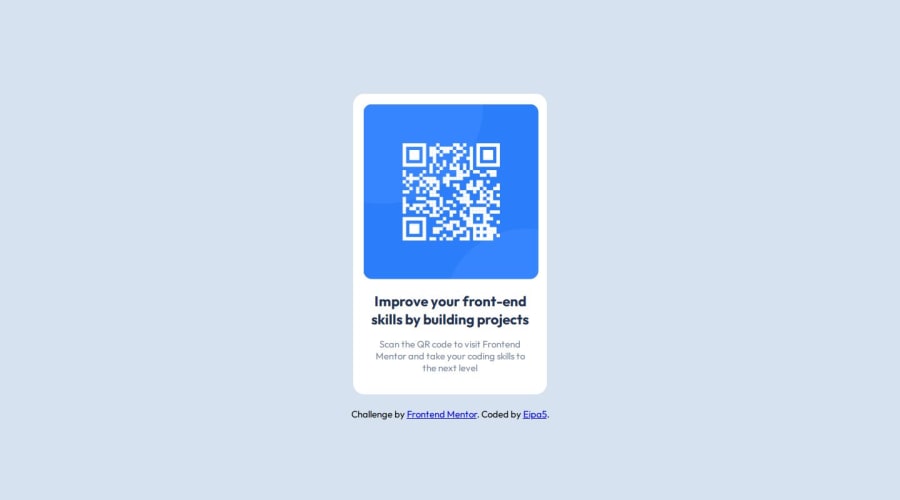
The layout is not exactly the same as the design. The text is a bit high up. Maybe try changing the margins and paddings. Since you have figma access, you can check and set the card dimensions to be exact. That might do the trick
0
Please log in to post a comment
Log in with GitHubJoin our Discord community
Join thousands of Frontend Mentor community members taking the challenges, sharing resources, helping each other, and chatting about all things front-end!
Join our Discord
