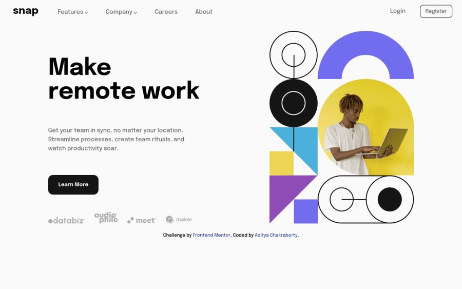
Desktop-first intro section with dropdown menu
Design comparison
Solution retrospective
Hello people of Frontend Mentor,
I took a desktop-first approach for this challenge. While the CSS I have written gets the job done, I know it can be better. Any tips or feedback on how to improve my CSS and code quality in general would be highly appreciated.
Thanks!
Community feedback
- @mubizzyPosted over 2 years ago
Excellent job on this challenge! your report has a few issues though:
- wrap everything in your body in
<main>
or use semantics
2. it is a best practice to use both HTML 5 and ARIA landmarks to ensure all content is contained within a navigational region.
Hope it helps:)...don't forget to mark it as helpful 👍
You can get more details here...click here
Marked as helpful0@aditya-chakrabortyPosted over 2 years ago@mubizzy Thanks a lot for the feedback. This is truly helpful.
0 - wrap everything in your body in
- @Alejandro25ARPosted over 2 years ago
Hi, your desktop solution is fine, but you could:
- Specify a "max width" on the header (menu) and on the hero and put a class on the parent to center it, so if there are larger desktop measurements the layout stays the same but centered
Regarding CSS styles, I would advise you:
- Stop using pixels and use rem or em measurements.
- It is not a good practice to make selectors with more than 2 elements, in "menu ul li a img" you would be using 5, this is for specificity reasons.
Keep practicing, good job.
Marked as helpful0@aditya-chakrabortyPosted over 2 years agoHi @Alejandro25AR, thanks a lot for the feedback and the tips!
Should I have used class names on each tag as CSS selector, instead of chaining them together?
0@Alejandro25ARPosted over 2 years agohi @aditya-chakraborty, you have two options:
1: Use 2 element selectors:
.menu ul {...} .menu li {...} .menu a {...} .menu .img {...}
It is not necessary, in this case, to chain so many tags since in the container that has the menu class there is only one ul, li, a and img
2: Name each tag with a class (I advise you to use this one):
menu__item {...}
menu__link {...}
menu__image {...}
Another thing, since you used flexbox in the
.menu a {}
tag, instead of padding the img you use thegap:1rem;
property to separate the img from the text:.menu a { display:flex; gap: 1rem; cursor: pointer; }
Marked as helpful1
Please log in to post a comment
Log in with GitHubJoin our Discord community
Join thousands of Frontend Mentor community members taking the challenges, sharing resources, helping each other, and chatting about all things front-end!
Join our Discord