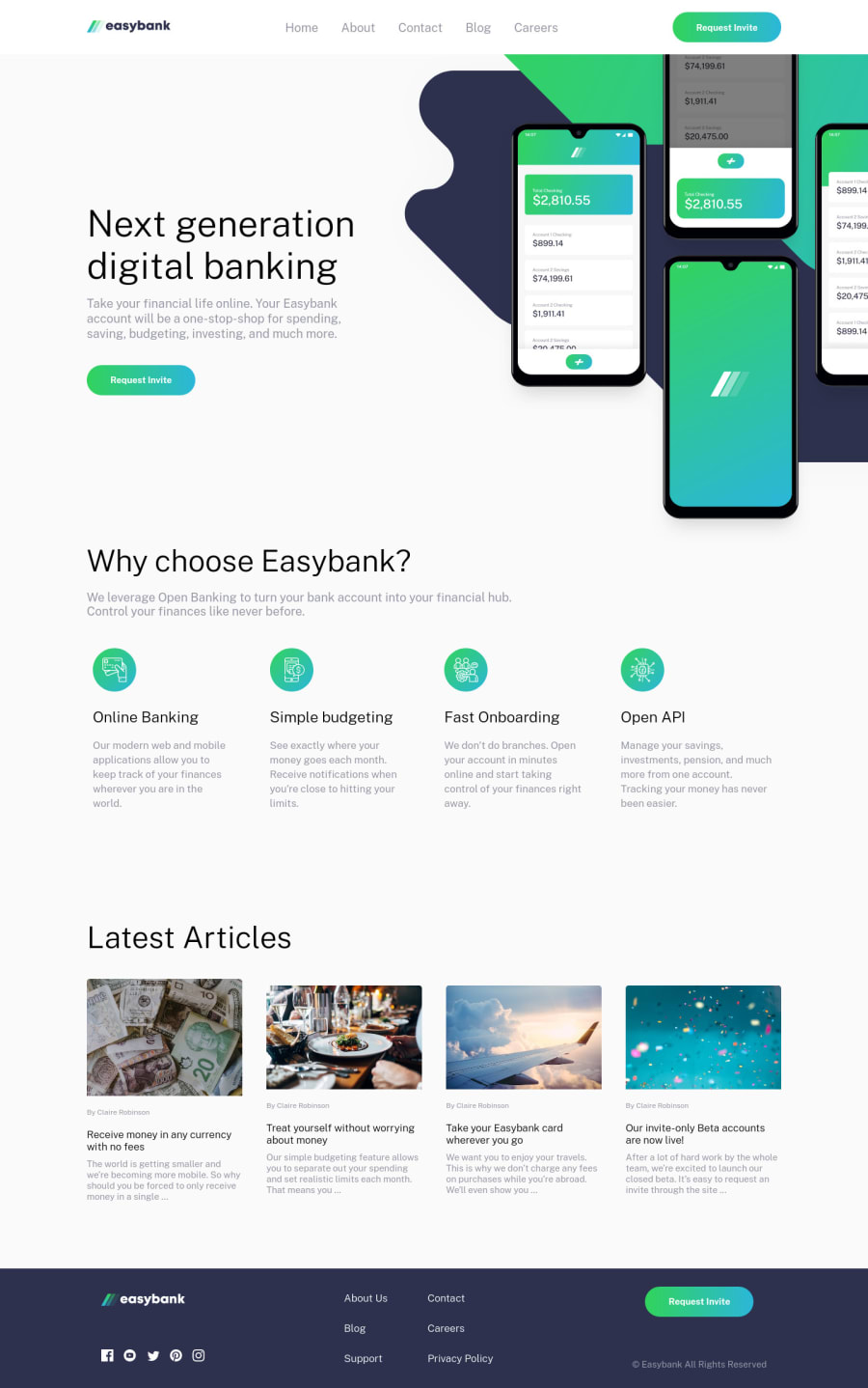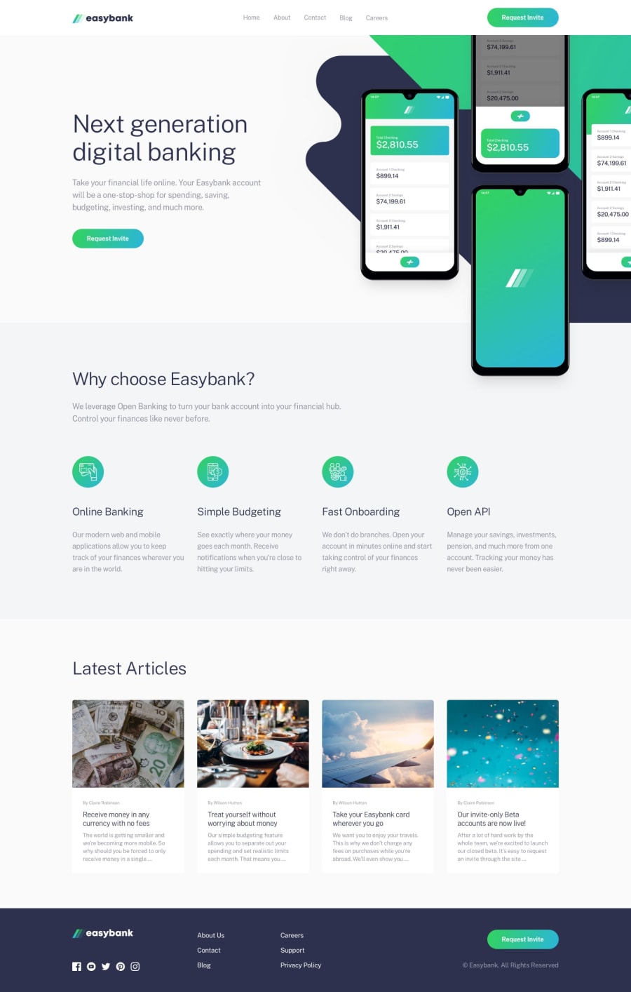
Design comparison
Solution retrospective
Feedback? :c
Community feedback
- @Sdann26Posted over 2 years ago
Este proyecto te quedo espectacular, y pensar que fue tu primer proyecto.
Yo soy muy minucioso con los detalles y solo podría decir que algunos titulos y subtitulos creo que están con otro color, no se si te dieron los colores o no porque aun no hago el proyecto pero uso el gotero que hay en firefox developer cuando quiero conseguir un color de alguna página o para sacar los colores de algún imagen o diseño que me hallan dado el siguiente enlace.
https://imagecolorpicker.com/es
Capaz ya lo hayas usado porque veo que tienes buena experiencia y nada solo eso un gusto haber si estas más activo en la comunidad.
Marked as helpful1@escarcanPosted over 2 years ago@Sdann26 Que grande amigo, estuve leyendo tus comentarios y me agrada que con unas palabras puedas motivarme a seguir estudiando. Llevo un poco mas de 1 año estudiando desarrollo web pero la verdad es que siento que ya me queme y dejo de estudiar por dias e incluso he pasado meses, pero gracias a personas como tu me dan mas animos a seguir :) Espero seguir leyendo tus comentarios en futuros proyectos.
1@Sdann26Posted over 2 years ago@CarlosReyes84 dale bro estamos en la mismas!! Sigue practicando de ves en cuando para no perder el ritmo no todos pueden hacer buenos maquetados o /. Saludos!
1 - @dwhensonPosted over 3 years ago
Hey @CarlosReyes84 great job here! 🙌 The site looks good and responds nicely.
I am currently battling this one, and have been doing OK but I really struggled with the positioning of the images and background in the top section. I wanted to see how you did it and it looks great!
Here are some small thoughts:
-
There's a lot of spacing around the top section which pushes the following sections down and looks a bit odd.
-
If you are going to look at details, then you'd probably want to have a think about adding some hover states to your links?
-
With regard, the 'buttons' these would probably be better as either actual
buttonelements or links styled like buttons depending what functionality you are imaging they will invoke. -
Lastly on overall structure, I would suggest that all the
sections andarticles should be inside themainelement, so that your high level structure is header, main, footer. -
Regarding your first
articleelement, I would suggest that the article should actually be a section or adiv, as an article should really be a section that could stand alone with no other content around it - like a news article or blog post. -
With this in mind, rather than an
articleI would suggest the child elements should also bedivs orsections. If we were to create a page with the full article that the child elements then that could be an article but otherwise I don't think it is really appropriate here.
I hope this helps and I hope to be able to submit my go at this later today and would very much welcome any comments or suggestions you might have at that time! A good chance for your revenge!! 👹
But great work 👍 and keep up the good efforts!! Cheers 👋
1@escarcanPosted over 3 years ago@dwhenson Thanks for all the feedback man! I'll keep that in mind. Definitely, The hardest part was the top section, trying to positon the background and the phone image was complicated, but i'll explain to u, u just have to create a div and inside it you have create 2 divs more, in the first one i just put the 2 background images and the phone image, and i change the background images to a position absolute(being relative to the main tag, i apply overflow-x to the main tag, you can check it), and in the second div i just put the h1, p tag, and the button. Finally, u just have to positon the background images to the corners, and apply flex to the main div, and the text content, and the phone image should take the flex properties.
1 -
Please log in to post a comment
Log in with GitHubJoin our Discord community
Join thousands of Frontend Mentor community members taking the challenges, sharing resources, helping each other, and chatting about all things front-end!
Join our Discord
