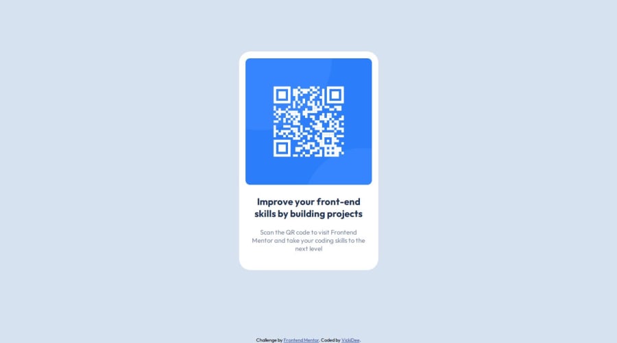
Design comparison
SolutionDesign
Solution retrospective
What are you most proud of, and what would you do differently next time?
That I've done my first challenge and it feels good taking that first step. Next challenge I'll plan it out a bit better now that I know how this process works.
What challenges did you encounter, and how did you overcome them?Refreshing myself with the coding I've learnt so far in my journey. Trust my instincts as well as use the resources out there.
Community feedback
- @bienvenudevPosted about 1 year ago
Hi there!
Good job.
Here are a few suggestions that might make things even better:
- The overflow issue is caused by changing the width of the body please remove the width on the body.
- Including a modern CSS reset at the beginning of your styles can help normalize browser defaults and provide a clean foundation for your project. Check out this article: https://www.joshwcomeau.com/css/custom-css-reset/
- Avoid setting font-sizes in px, use rem instead (https://www.joshwcomeau.com/css/surprising-truth-about-pixels-and-accessibility/#accessibility-considerations-5).
- Instead of setting a fixed width on your card, consider using max-width in REM units. This allows the card to adapt to different screen sizes while maintaining its layout.
- Similar to width, avoid setting a fixed height on your card. If you need extra space around the text, use padding instead. This ensures the content can adjust to different content lengths.
I hope these tips are helpful! Feel free to ask any questions you might have.
Marked as helpful0
Please log in to post a comment
Log in with GitHubJoin our Discord community
Join thousands of Frontend Mentor community members taking the challenges, sharing resources, helping each other, and chatting about all things front-end!
Join our Discord
