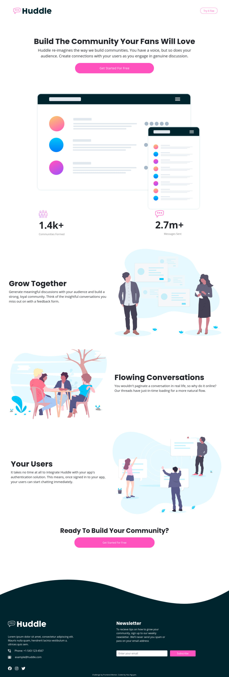
Design comparison
Solution retrospective
I just finished solution for desktop version. It seems like for mobile version, I should build the entire page! Please help me any way to build desktop and mobile version with less effort...!
Community feedback
- @mickygingerPosted over 3 years ago
Hi Hau! 👋
This looks great, well done!
As for tips on building pages for different screens, it's generally better to build the desktop version first then modify the design using the
@mediaquery.Here's a tutorial that might be useful: https://web.dev/responsive-web-design-basics/
Hope that helps!
Edit: I just noticed that you are using bootstrap for this. Bootstrap comes with its own helper classes for different screen widths. Check out the grid system docs: https://getbootstrap.com/docs/5.0/layout/grid/
0@haunguyen1064Posted over 3 years ago@mickyginger thank you very much for your reply. I knew Bootstrap has that features, but I see that there are a lot things need to modify. I think better I should design a wireframe what will be changed before coding. Anyway, thank you, this is the job developer have to do, right :D
0
Please log in to post a comment
Log in with GitHubJoin our Discord community
Join thousands of Frontend Mentor community members taking the challenges, sharing resources, helping each other, and chatting about all things front-end!
Join our Discord
