Submitted over 1 year ago
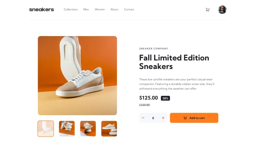
Desktop solution for e commerce product Main
@NelsonGuiamba
Design comparison
SolutionDesign
Solution retrospective
This is the desktop solution only
Community feedback
- @lwrncgmbnPosted over 1 year ago
Hello, the things I noticed are:
- The minus and plus sign, I think its better if you put the plus to the right and minus to the left
- In the cart, the remove button is not working
- Also you can change how the cart works, since it's the same product you can just make the count add up, instead of putting a different list with every press of the button
- Lastly, it's not working in the mobile layout
Happy Coding 😁
0@NelsonGuiambaPosted about 1 year ago@lawrencegumabon Thank's for your review, i'll add these features I was waiting to finish a react course
0
Please log in to post a comment
Log in with GitHubJoin our Discord community
Join thousands of Frontend Mentor community members taking the challenges, sharing resources, helping each other, and chatting about all things front-end!
Join our Discord
