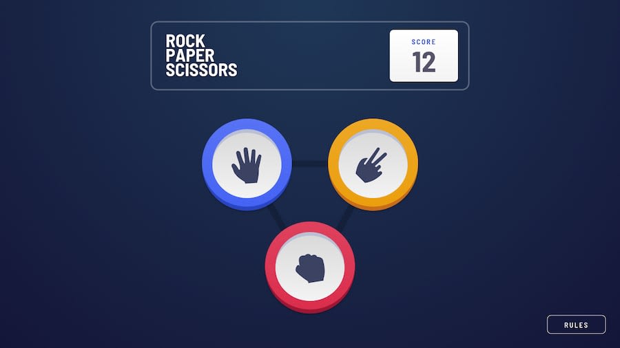
Design comparison
Solution retrospective
What do you think, should I make the mobile version?
Community feedback
- @gabrielteresczukPosted over 2 years ago
A pretty nice project, the shadows, the animation i really loved. The only little thing is the preview site need to be the Live Site Url, for the FrontEndMentor report. Everything else is excellent. it is clarified in the project that it is only the desktop version. Good work and keep up 💪
Hermoso proyecto, las sombras, las animaciones realmente me encanto. La unica cosita es que el sitio de preview, tiene que ser el "live site url", para que FrontEndMentor, te genere el reporte. Todo lo demas esta excelente, esta claro, que el proyecto es solo la version de escritorio. Buen trabajo y segui asi! 💪
0@loicmaesPosted over 1 year ago@gabrielteresczuk First thing first, thanks for your constructive and helpful comment.
When I posted my web site, I didn't know how to use GitHub Pages to host the live preview website... Now I know how to use it and I may use it for my next FrontEndMentor project.
Have a nice day.
0 - @piushbhandariPosted over 2 years ago
pretty much a given that when you make a web app/page that it should be responsive too. sucks i know but it's part of the job
0@loicmaesPosted over 1 year ago@piushbhandari Sorry for my late answer ^_^' The responsive is not done yet because I don't have time to upgrade it... I know that it must be done because it's the main part of my Job but as I said, no time...
Thanks for your constructive comment. Have a nice day
0
Please log in to post a comment
Log in with GitHubJoin our Discord community
Join thousands of Frontend Mentor community members taking the challenges, sharing resources, helping each other, and chatting about all things front-end!
Join our Discord
