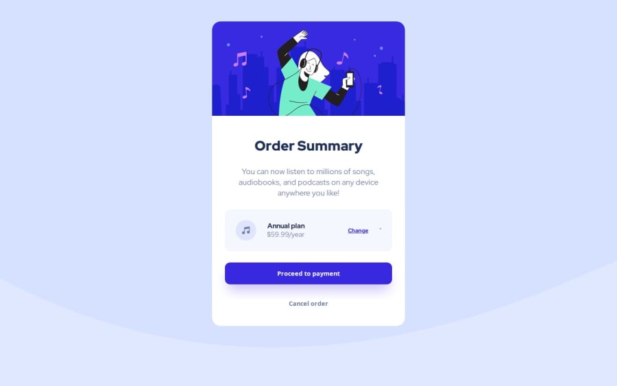
Design comparison
Solution retrospective
I am most proud of the end result, the small tweaks and changes I saw occur as I inputted code and check the design were most rewards to me. Next time I'd like to try a different text editor to see if there is a difference. I'd also like to switch up images and text to see what that conversion rate would be at the end result.
What challenges did you encounter, and how did you overcome them?I experience quite a few typos (on my end of course) that would mess up something in the result and thankfully I was able to back track and catch them in a timely manner.
What specific areas of your project would you like help with?I'd like help with understanding the , another example of a parent an child , and to play with the 4 Selectors of CSS (Panning, Margin, Border, and Content).
Community feedback
Please log in to post a comment
Log in with GitHubJoin our Discord community
Join thousands of Frontend Mentor community members taking the challenges, sharing resources, helping each other, and chatting about all things front-end!
Join our Discord
