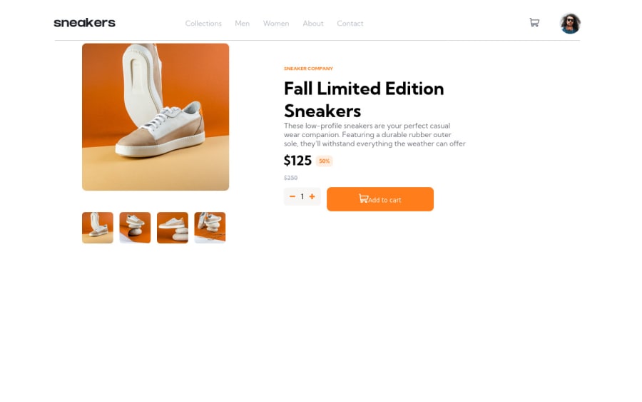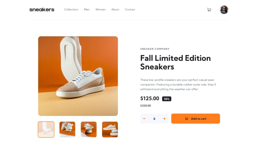
Desktop Only: Ecommerce Website Challange with React, Vite and JSX
Design comparison
Solution retrospective
Hey, I was curious how I can make this website more responsive, I wasnt able to shrug off constantly having to put pixels and margins on things and I now understand that using percentages is not any good. Any tutorials on learning how to position items better?
Community feedback
- @sulemaan7070Posted almost 2 years ago
Hey jamal, your site feels broken on the mobile version. You need to do more work on that.
- You can give minimum height to the cart list when we remove items from it. It is shrinking down
- You can make the cart button as position:relative; and position the position: absolute; to the span elements (which is having the items count).
- You can make the header as sticky so that it can always stick to the top on the mobile-screen And you did a good job on the desktop version Hope my feedback helps you
0@JamalLovesLoversPosted almost 2 years ago@sulemaan7070 Thanks, wasn't too focused on the mobile version here but ill keep it in mind, there is so many design flaws since I was using a beta version of vite so after I built it a lot of things had to be fixed, not sure what the problem was. Thanks anyway
0
Please log in to post a comment
Log in with GitHubJoin our Discord community
Join thousands of Frontend Mentor community members taking the challenges, sharing resources, helping each other, and chatting about all things front-end!
Join our Discord
