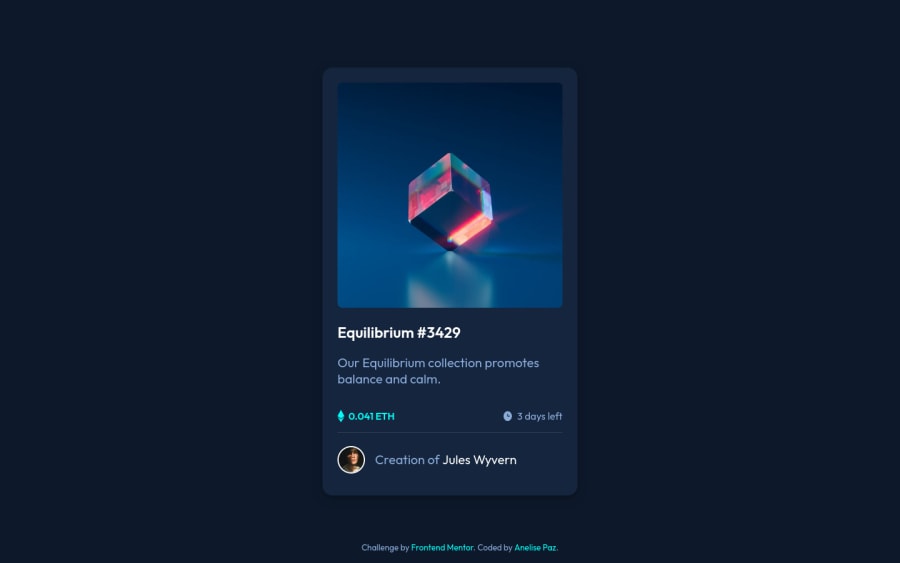
Design comparison
Solution retrospective
Feedback on how I can reduce code and/or optimize will be much appreciated
Community feedback
- @Mr-jawPosted almost 2 years ago
Hello there 👋
Congratulation on completing the challenge
HTML 📄
-
replace
<div class="attribution">with<footer>tag to fix accessibility issues. -
avoid using the
<span>tag to display texts alone since it is used to group inline elements. you can rather use<em>,<strong>or<small>to display short text. It will improve accessibility as well
CSS 🎨
-
It is a good practice to use CSS custom properties. learn more about it here
-
Also you have done a good job in using relative units
Here is a quick fix to display the
spanelement text in one line- In the
spanelement replacewidth: fit-content;withwidth: 100%;
What you could have possibly missed
-
The hover effect when hovering over the Equilibrium image.
-
the hover effect when hovering over Equilibrium #3429
I hope this was useful 😊
HAPPY CODING
1@anepazPosted almost 2 years ago@Mr-jaw Thanks for the reply! I'm taking your advice. Soon it will be updated!
0 -
Please log in to post a comment
Log in with GitHubJoin our Discord community
Join thousands of Frontend Mentor community members taking the challenges, sharing resources, helping each other, and chatting about all things front-end!
Join our Discord
