Design comparison
SolutionDesign
Solution retrospective
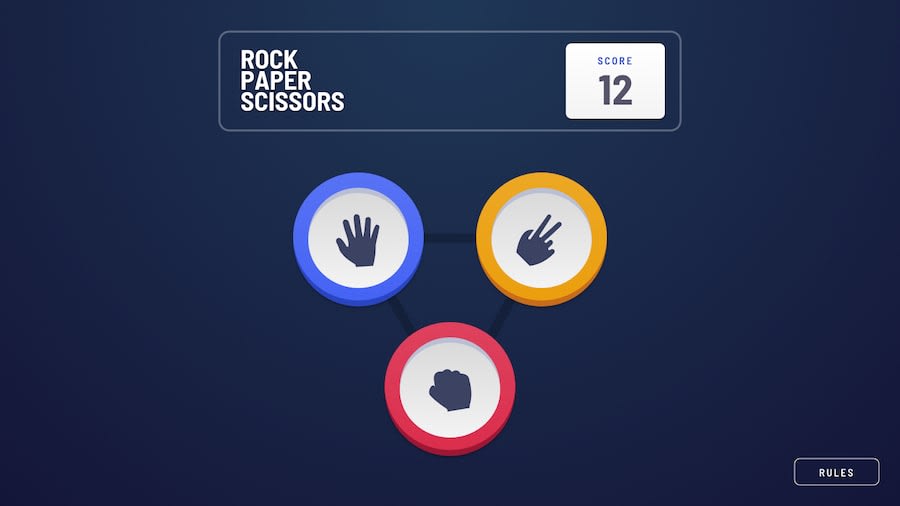
This is only desktop mode. I worked on making this more responsive but there were a lot of moving pieces. My main focus for this challenge was more about getting the logic to work and less about the UI. Other than making the UI more presentable, any suggestions on improvement?
Community feedback
- @kitindiPosted over 4 years ago
Great work ! I did the console version of it, this is very inspiring, I will try to do the UI version of it like yours
1@just-a-devguyPosted over 4 years ago@kitindi thank you. The UI is not hard to build, it just has a lot of moving pieces. It can be somewhat frustrating. If you need help with anything, feel free to reach out to me on slack :)
0
Please log in to post a comment
Log in with GitHubJoin our Discord community
Join thousands of Frontend Mentor community members taking the challenges, sharing resources, helping each other, and chatting about all things front-end!
Join our Discord
