Submitted almost 3 years ago
Desktop first solution using css-grid and flexbox
@Abu-Sman
Design comparison
SolutionDesign
Solution retrospective
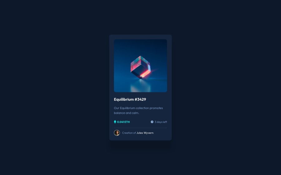
Can I please get a feedback on my hover and active state?
Community feedback
- @ApplePieGiraffePosted almost 3 years ago
Hi, Sulaiman! 👋
Very sorry for my late reply! 😅 Been a bit caught up with school and things recently! 🏫
Great work on this challenge! 👍 Your solution looks pretty good! 😀
A couple of small things I'd like to suggest are,
- Writing some more descriptive text for the
alttext of the main image of the card component. "The Preview Card Component Image" doesn't really say anything about what the actual content of the image is to people using screen readers. 😉 - Wrapping the heading of the card component in a heading tag and perhaps using an
articletag for the entire component (since it is a self-contained element that makes sense without additional context from a parent component). This'll just bump up the semantics of your HTML a little. 😄
Again, these are just small points. Overall, you've done well on this challenge! 👏
Hope you find this helpful. 😊
Keep coding (and happy coding, too)! 😁
Marked as helpful2 - Writing some more descriptive text for the
- @BaqtiyarPosted almost 3 years ago
Hover is working nice but the there is lots of CSS code you have used, try to use less code with which would be more efficient, I give this advice to myself as well.
Marked as helpful1
Please log in to post a comment
Log in with GitHubJoin our Discord community
Join thousands of Frontend Mentor community members taking the challenges, sharing resources, helping each other, and chatting about all things front-end!
Join our Discord
