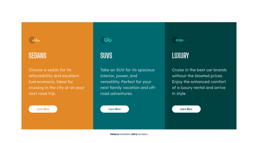
Desktop First Solution Using CSS Grid and Flexbox
Design comparison
Solution retrospective
Hello Everyone,
One of my smallest yet biggest struggles was with the mobile css. On desktop, I have my container set as flex-box with the direction set as column. The two children inside are the columns div and attribution div. When I tried styling the mobile css, the attribution div kept staying in the center of the page. It would sit on top of the second (middle) column. I ended up simply putting the display to none but would love an explanation on what I could have done to still included it at the bottom.
Thanks!
Community feedback
- @aUnicornDevPosted over 3 years ago
The height of 100vh on
.columnslimits sets a fixed height on columns grid and therefore the attribution is placed right next to the end of the 100vh of the grid.Try using a smaller height viewport and you will notice that the attribution sits just after a smallest vertical scroll.
Remove that height.
That also does not fix the issue because the first card will go above the screen which is even more confusing.
And that is caused by another 100vh given to the
.container. Because you have centered the flex within a 100vh, such misalignment occurs.Remove both the 100vh and this will work fine.
0
Please log in to post a comment
Log in with GitHubJoin our Discord community
Join thousands of Frontend Mentor community members taking the challenges, sharing resources, helping each other, and chatting about all things front-end!
Join our Discord
