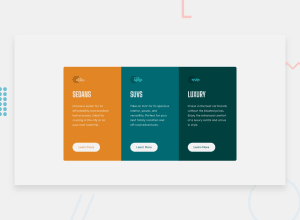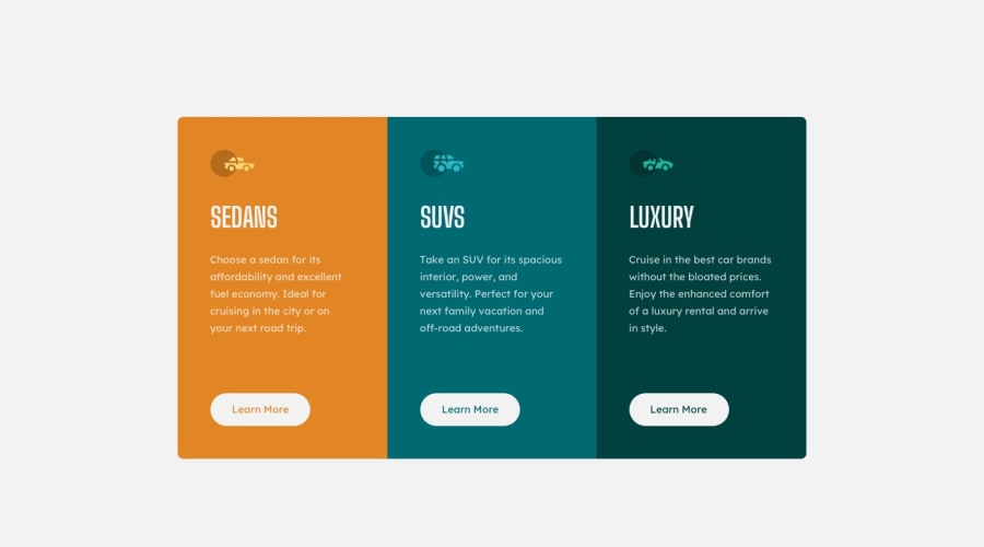
Design comparison
Solution retrospective
Is there anything I should have done? Are the codes clean enough?
Community feedback
- @grace-snowPosted over 3 years ago
Hi
See if you can fix the issues raised by others. Also I notice the buttons are very small and lots of minor details don't match the design.
See if you can work out how to ensure the buttons stay lined up at the bottom of the cards, no matter how much content is in there or screen size used. That is a really common thing you will have to do in real jobs.
Good luck
0@grace-snowPosted over 3 years agoIn the html. You need to swap the buttons for anchor tags too, as their purpose is navigation. Make sure you add visible focus states to interactive elements so keyboard users know where they are on the page
0@didheePosted over 3 years ago@grace-snow
Thank you so very kindly. I'll work on this solution again.
Thank you.
0 - @jamiem89Posted over 3 years ago
All looks good to me. The only feedback i'd give is this: You're switching to the desktop view far too early. Between 375px and 900(ish)px, everything looks very squished in and it gets uncomfortable for a viewer to read.
0 - @palgrammingPosted over 3 years ago
- look at your design in the browser
- now in desktop layout make your browser wide and narrow and try to find the element that is changing size the most 3.now what element is the expanding element effecting on the page
- now if you put a fixed height tall enough to fit the changing element so it stops changing what happens to you page
0
Please log in to post a comment
Log in with GitHubJoin our Discord community
Join thousands of Frontend Mentor community members taking the challenges, sharing resources, helping each other, and chatting about all things front-end!
Join our Discord
