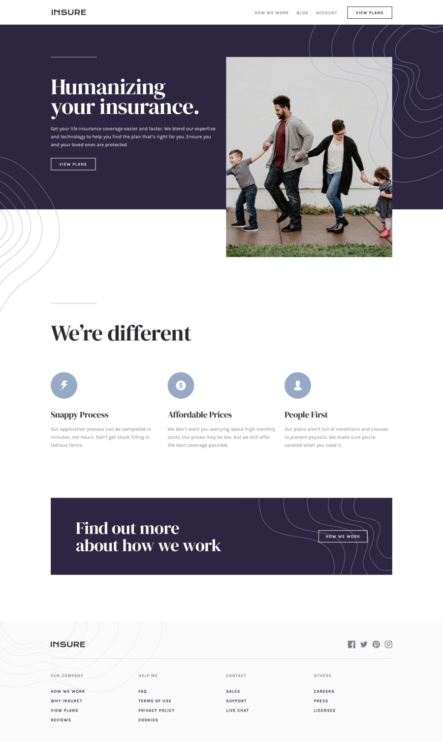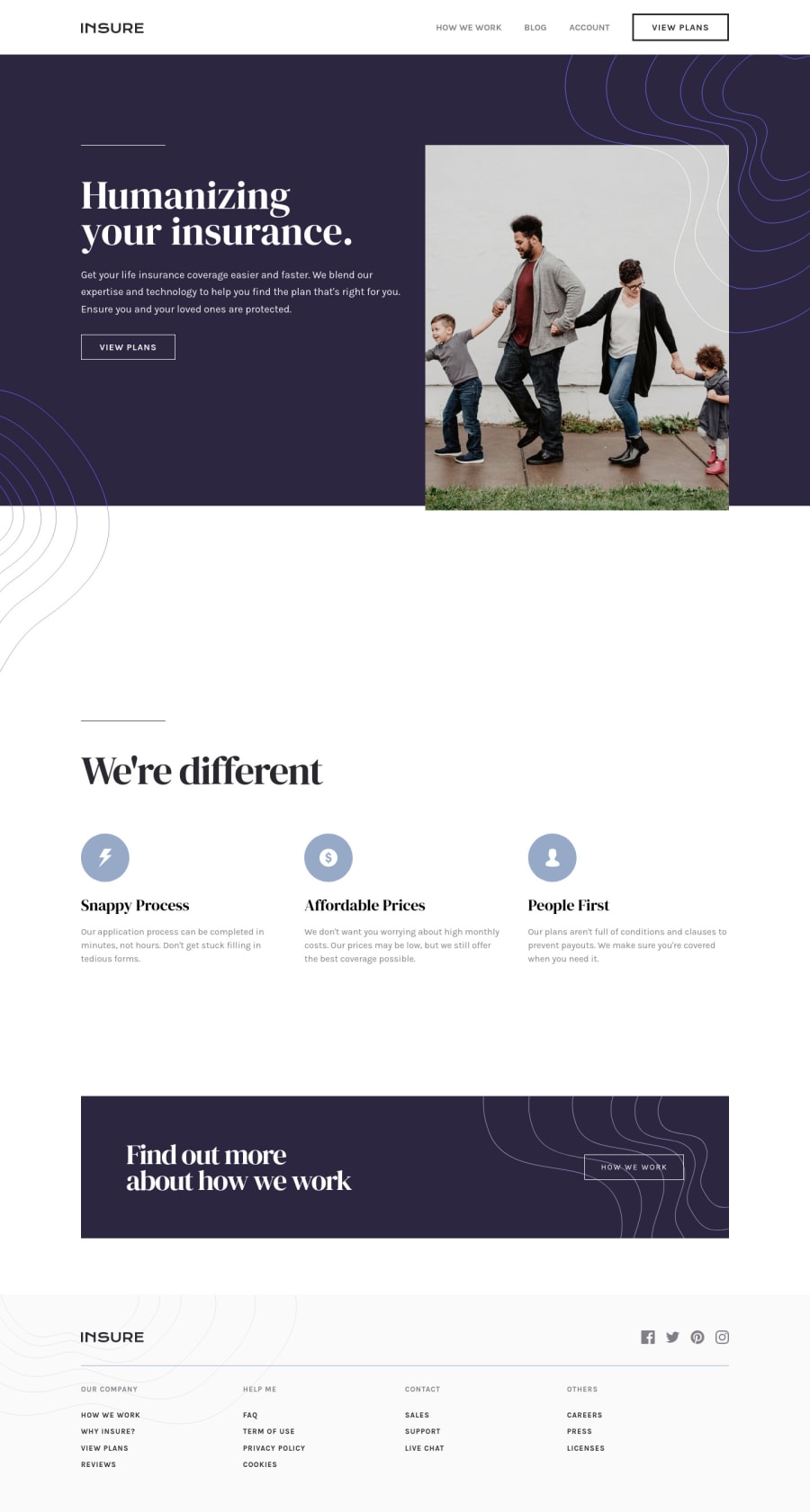
Submitted over 3 years ago
Desktop first Responsive Landing Page using CSS Grid, Flexbox
@imjackfrost1997
Design comparison
SolutionDesign
Solution retrospective
It takes me 2days to build this website using CSS Grid and Flexbox at the same time I'm practicing and experimenting on that properties any feedback will be appreciated thankyou ;)
Community feedback
- @yasssuzPosted over 3 years ago
Hello Jack!
CSS Grid and Flexbox are awesome features. But remember:
- flexbox: when you're working with mono-dimensional layouts, for example, a navbar. Because you could put a space between the logo and the nav, or you want your logo at the left, nav in the middle, and buttons on the right and you can do that with just a line of code justify-content: space-between;
- grid: when you're working with bi-dimensional layouts, in fact, It helps us to create layouts that can be redefined using Media Queries and adapt to different contexts. Grid Layout lets us properly separate the order of elements in the source from their visual presentation.
Happy coding and please upvote my comment if I was helpful :)
0@yasssuzPosted over 3 years ago@imjackfrost1997 you're welcome, please upvote my comment if possible to support me :)
1
Please log in to post a comment
Log in with GitHubJoin our Discord community
Join thousands of Frontend Mentor community members taking the challenges, sharing resources, helping each other, and chatting about all things front-end!
Join our Discord